It is typical of Ron Terada’s practice to play with the act of looking. His most recent exhibition at Catriona Jeffries, “TL;DR,” tackled how digital technology’s advancement affects our perception of the world.
Terada often creates subtle ambiguities by juxtaposing both familiar and unusual found images and texts, and in this exhibition, many of his works reference the same place he sourced the exhibition’s content: in the screen. Terada’s use of computer-assisted manipulation obscures the artist’s painterly gesture. This, and his appropriation of dated graphics and clickbait headlines, attests to his interest in obsolescence.
For example, in Big Toast Logo #01–18 (2016) Terada superimposes corporate logos from institutions such as Loblaw and National Bank onto posters depicting a Macbook and headphones from the early 2000s. The objects in the work are outdated, each item a remnant of what used to be considered on the cutting edge.
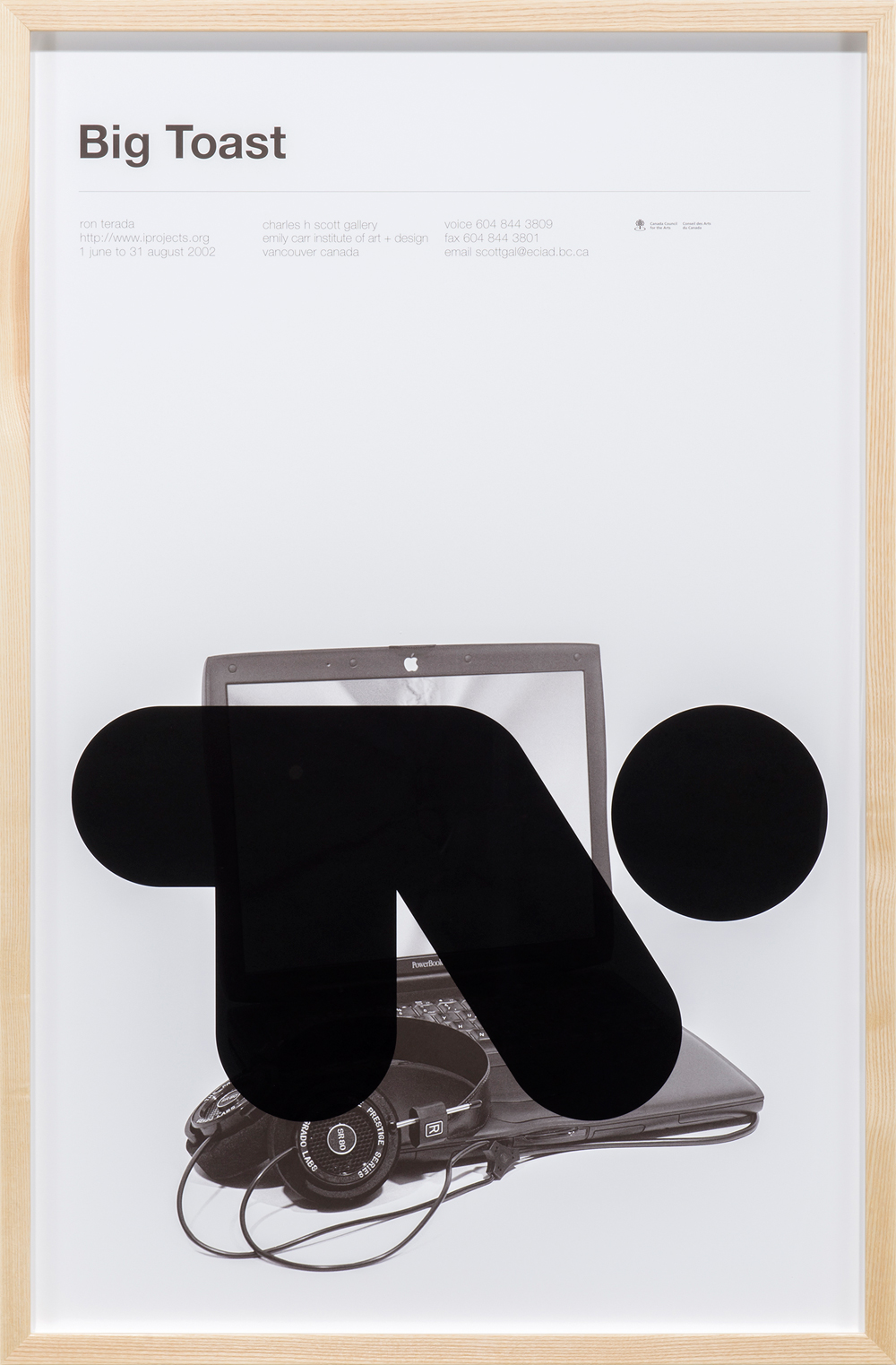 Ron Terada, Big Toast Logo #01–#18, 2016. Inkjet print on offset printed poster, 34 x 22 in. Photo: SITE Photography. Courtesy of Catriona Jeffries.
Some of the logos are recognizable, and some aren’t. “[Not] only do [these logos] mark a moment of modernist design, which has reached its mature conclusion,” Terada told me in an interview, “but they signal that for a corporate entity to exist they couldn’t rely on graphic symbols any longer.”
Big Toast Logo therefore demonstrates how networks of power have adapted elements of their brand identities to the demands of the digital market, obscuring their original graphic identity.
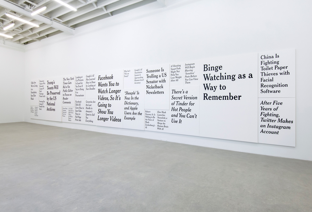
In his Verge series, Terada painted headlines culled from The Verge, a website dedicated to exploring how technology might impact our way of life in the future. Each headline is absurd and meaningless, like “Drones Keep Dropping Drugs and Porn into Prisons,” “Odds Are We’re Living in a Simulation, Says Elon Musk,” or “Facebook Wants You to Watch Longer Videos, So It’s Going to Show You Longer Videos.”
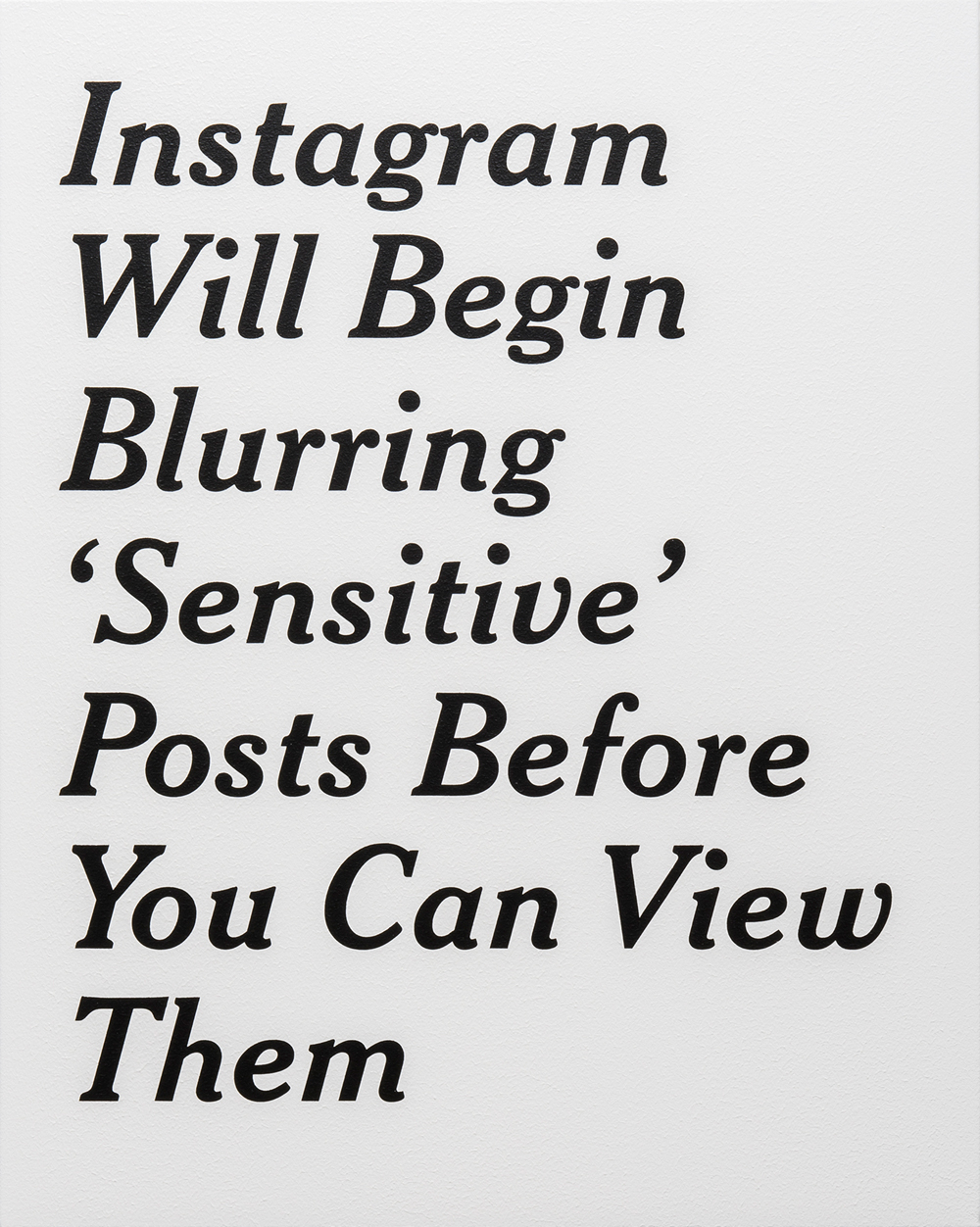 Ron Terada, Instagram Will Begin Blurring ‘Sensitive’ Posts Before You Can View Them, 23 March 2017, 10:23 am , 2017. Acrylic on canvas, 30 x 24 in. Photo: SITE Photography. Courtesy of Catriona Jeffries.
Terada titles each painting after the date, hour and minute that each headline was originally posted. By doing so, he prohibits our ability to swipe away from the work. He also addresses how information constantly becomes obsolete through the continual regurgitation of new information generated by mass media.
“Painting becomes a ridiculous vehicle to try to understand [these headlines], because painting has the capacity to slow things down,” Terada explains. “Painting is all about suspending time in some ways, or at least capturing it and holding it, in a very different manner, as opposed to constantly swiping or liking.”
Terada changes the way we digest the information he presents to us by barring our ability to perform the gestural movements associated with our digital devices. Whether we read these texts on our phones or in the paintings, the cultural shifts they track are drastically changing the way we interact with objects and images.
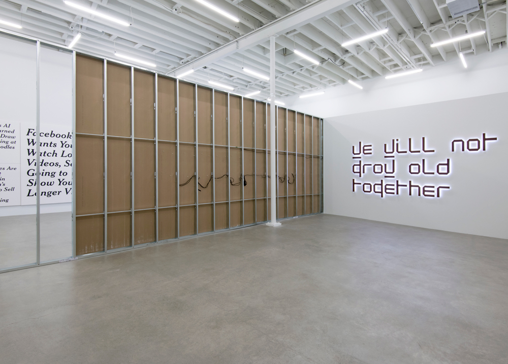 Ron Terada, We Will Not Grow Old Together, 2014. White neon, rusted corten steel, birch plywood, 61 x 136 x 3 in. Photo: SITE Photography. Courtesy of Catriona Jeffries.
Blurring the lines between art and economy, Terada’s work acts as both a critique and a melancholic proclamation of technology’s increasing incisions into our lives. We Will Not Grow Old Together (2014) emphasizes technology’s impact more strongly than any other piece in the exhibition. A large neon sign, given that it uses the typeface New Alphabet, a typeface created in 1967 by Wim Crouwel to embrace the limitations of the cathode-ray tube technology used by early data display screens and phototypesetting equipment.
Since the New Alphabet typeface uses only vertical and horizontal strokes, the viewer is barely able to discern the letters that the shapes mimic; the type significantly reduces the legibility of the text, often blurring the distinction between numbers and letters. Here, Terada’s work demonstrates how advancements in technology do not necessarily equate to improvements in clarity or comprehension.
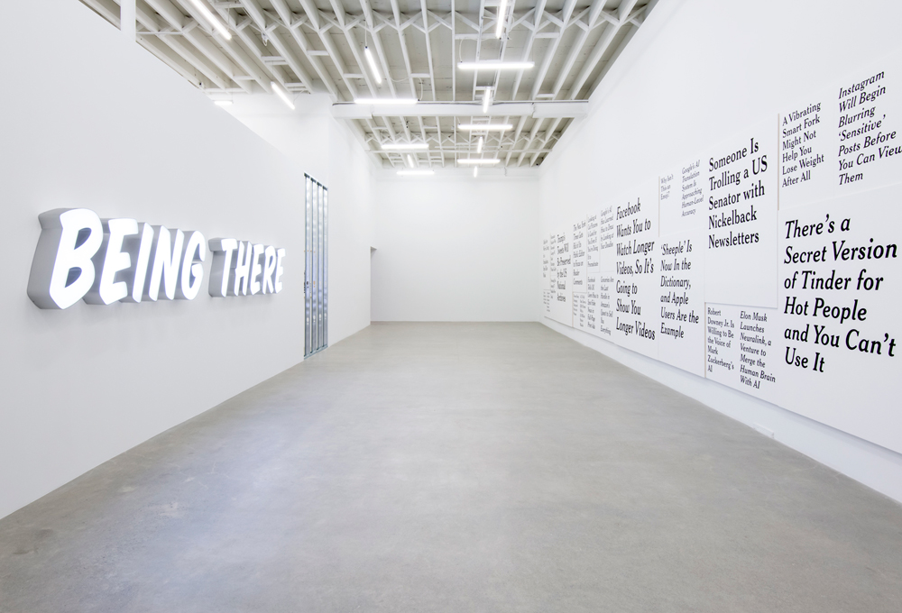 Ron Terada, installation view. Vancouver. Photo: SITE Photography. Courtesy of Catriona Jeffries, Vancouver.
Being There (2011) is a large illuminated sign drawn from the 1979 film of the same name. The main character of the film, Chauncey Gardiner, is a simple, naive man who spends most of his life confined to a small estate, experiencing the world through his television, frequently conflating television with reality. As our reliance on new forms of communication increases, it becomes ever harder to know what is true.
The exhibition’s title references the slang for “too long, didn’t read.” Internet users might type “TL;DR” to accompany a lengthy post or article with a simplified, condensed summary of its contents. Such summaries are aimed at someone who might not feel they have enough time to read a lengthy text, and while they provide a gist, they are quite distinct from an experience of reading the original, complete copy. Similarly, each of Terada’s works carries specific connotations within the context that it was created in, but when the works are presented as a whole, their meanings shift.
Helen Wong is an arts writer based in Vancouver. She is also interim development officer at the Contemporary Art Gallery and fair coordinator for the Vancouver Art Book Fair.

