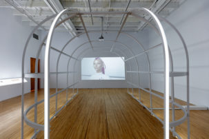
Each of Terris’ apartments has been designed to represent a different decade, beginning with the 1950s on the ground level and continuing to the 2000s on the top level. Visitors can enter and make themselves at home in two of the apartments—the one from the 1950s and the one from the 1980s. From there, they can see into the other levels through aluminum scaffolding and architectural gaps that function as vantage points. Interesting angles can be experienced from the stairs that envelop the rotunda and from the outer areas of the other art exhibitions on display—not to mention voyeuristic glimpses from the gallery escalators. The apartments are furnished with original items from each decade that the artist collects through his job as a residential contractor, objects that would have otherwise been thrown away during the renovation process.
The word ought originated as the past tense of to owe, and according to the dictionary we are to reserve ought for expressing moral obligation or duty. So the title of Terris’ piece suggests a possible twofold meaning: First, that objects proclaimed to be ideal by the design industry are what we are made to feel we ought to possess. Second, that it is, from a more moral reading of the word, necessary to develop sustainable practices in home renovation, as well as an economic structure that can accommodate environmental concerns.
Nonetheless, it is the merging of public and private space, as well as the relationship between viewers and objects, that remain the strongest aspects of the work.
Ought Apartment invites visitors to intermingle their private domestic experiences with the somewhat impersonal public space of the gallery. This ends up changing our usual perception and experience of each. From an architectural standpoint, Terris worked within the constraints of the neoclassical circular rotunda design and adapted the domestic tower to the existing space. The aluminum scaffolding not only provides a functional grid structure for the installation, it also works to aesthetically bridge the public and private areas together.
For example, as I walked through the apartments, paying close attention to the interior design and domestic objects from the past, I began to feel as if I was truly in someone else’s home. I then encountered the scaffolding and was reminded that this space is a constant work in progress, always being updated according to the popular fads of the time.
Ought Apartment’s scaffolding also symbolizes the ongoing condominium development in Vancouver, the condensing of public, urban space; this is further captured in the layout changes that occur from one apartment to the next. Every detail has been considered when personalizing the private spaces, from the bits of gold shag carpet installed at the edge of the gallery’s marble staircase to the placement of cards and a candy dish on the 1950s coffee table.
Terris’ artwork also encourages us to think about how consumerism shapes us as individuals. As I walked through the apartments, I was inspired to take on the role of detective, searching for clues to the personalities that belonged to each of the homes. One pop culture artifact I observed speaks well to the blending of public and private in personal and cultural identity—it was a framed photo of Princess Diana on a kitchen counter of the 1990s apartment, seen only from a distance across the space of the rotunda on the third floor of the gallery.
Throughout my encounters with Ought Apartment, I became increasingly aware of my position, both physical and mental, and became increasingly sensitive to how this position was influencing my perception and therefore my experience and interpretation of the work. It would seem that the next step is to expand the conversation away from nostalgia and towards the social implications of our individual relationships with consumerism. (750 Hornby St, Vancouver BC)


