Jimmy Limit’s exuberant installation “Show Room” offers much to delight and amuse. A parody of shipping-supply company Uline’s catalogue, the installation is divided into a Show Room and a Stock Room (both 2013).
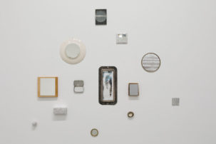
Show Room is populated by photos of fantastical items concocted from quotidian elements like a pineapple and a plastic pipe joint. Stock Room boasts a shelving unit scattered with sculpted “products.” A few wall-mounted sculptures extend the conceit. Completing the installation is a catalogue that can be used to purchase items indexed by attributes, such as “Icepack with Orange Rope,” described as “assemblage, control, guilt, isolation, nobody, sadness, unity.”
The soul of the show resides in the gorgeous photographs of Limit’s invented menagerie. These intriguing objects are characters in their own right, who could be auditioning for the next Pixar movie. One fully expects the “Crowbar with White Tube” to jump out of its frame and hop around the floor.
There’s more than cleverness at work. The humble, truly individual creatures stand naively before us in their nakedness, combining wit and poignancy. These creatures are photographed against boldly coloured paper. This generates an emotionally saturated, formless space in which background gets pushed to the fore and becomes an essential part of the subject matter.
Stock Room is less satisfying. The lone shelving unit is not fully stocked; its sparseness undercuts a fulsome experience of “stock.” What’s on the shelves is more problematic, moving the project away from invented characters to inert objects. Based on showroom promises, we’d expect to find dozens of crowbar creatures or ice packs with orange ropes. Instead, there’s a desultory stack of sponges, some ceramic vessels and the like.
The tension between the idiosyncratic individuality of these invented characters and commercial mass production does not seem to have been fully explored. The power of creatures like “Pipe Cap on Yellow Fruit” is that they are one of a kind—a very special kind. Limit, a recent OCAD University grad, seems to have a surfeit of ideas. In this case, less might deliver more. Presenting the Show Room images together with the catalogue might have made a more cohesive exhibition; it might have encouraged a deeper entry into the magic of these images.
This is a review from the Summer 2013 issue of Canadian Art. To read more from this issue, please visit its table of contents.

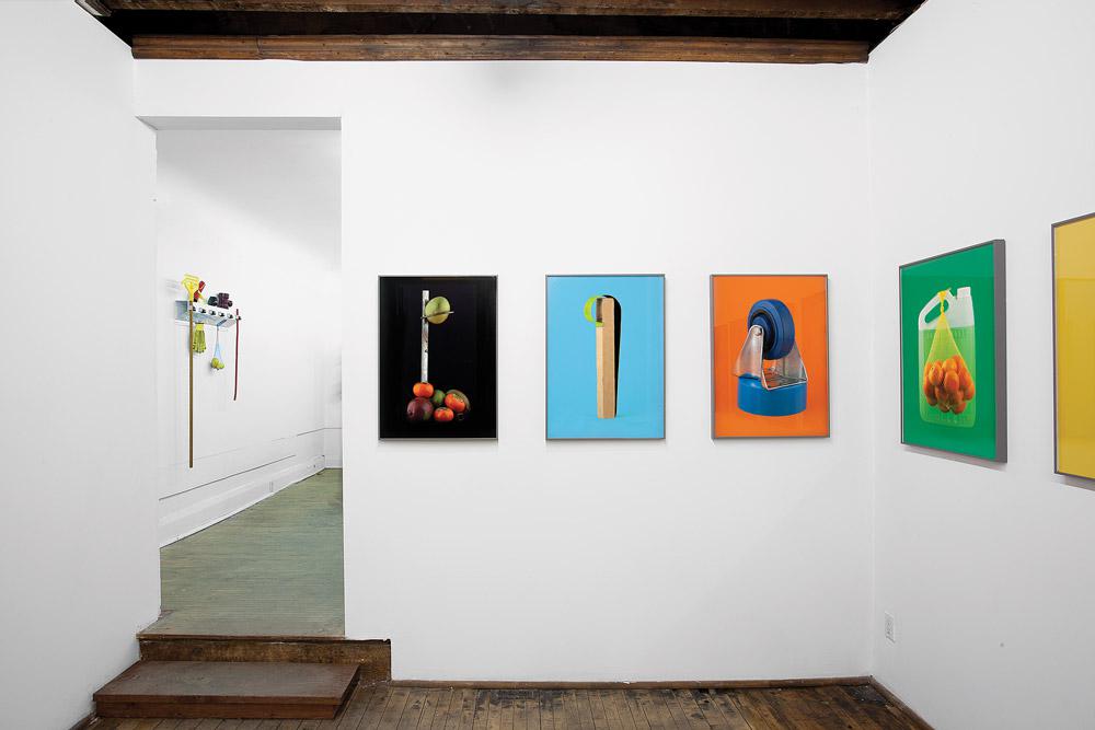 Installation view of Jimmy Limit's “Show Room” 2013 Courtesy Clint Roenisch / photo Jimmy Limit
