Holger Kalberg’s exhibition of new works at Clark & Faria, fittingly titled “Painting/Collage,” was an inspired conversation between two mediums that have had an uncomfortable co-existence.
Looking at the works in this show, I couldn’t help but be reminded of how painting and collage began as allies. Pablo Picasso and Georges Braque jointly invented the collage medium in 1912 amidst efforts to advance the development of cubism. Collage helped Picasso and Braque reform their painted experience of three-dimensional vision by enabling them to literally fuse reality and art, with their experiments featuring newsprint, oilcloth, wood-grain paper and product labels. Later, painting and collage began taking disparate paths when dada artists introduced photomontage—with the gap between the mediums widening as photomontage reigned supreme in the pop and pictures-generation eras.
In this exhibition, Kalberg boldly rejected collage’s overwhelmingly photo-based history and paid homage to the medium’s roots. His Structure is an electric composition of vivid colours, bold lines and graphic shapes. The central “structure” is built using strips of paper painted black, pink, orange, green and blue. Rounds of colour punctuate the imagined space like flare in a photograph. The pasted elements float against a painted, dreamy blue background. The importance given to the picture’s depth gestures to the dilemma that inspired Picasso and Braque to adopt collage as an art-making tool in the first place: pictorial flatness.
| <img src="/online/reviews/2010/08/17/kalberg_img2.jpg" alt="Holger Kalberg Monza 2010 Courtesy Clark & Faria” style=”border: 1px solid #C0C0C0; clear: both;” /> | |
|
Holger Kalberg Monza 2010 Courtesy Clark & Faria |
What’s most compelling about this work is that this simple, beautiful fantasy landscape was imagined using cutouts from self-made source material. It is unclear whether Kalberg cut up studio scraps, previously existing works or intentionally painted papers, but it is of little consequence. What is important is that he has created a closed circuit of creative production. It’s rare for collage to exclude the external world, and the results are surprising, fresh and contemporary.
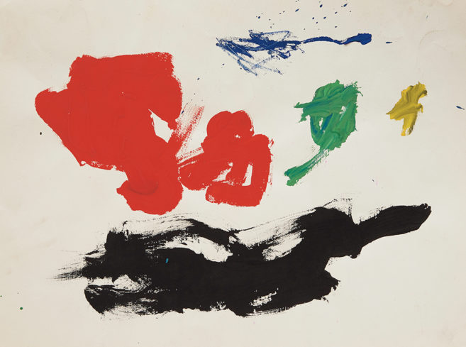
The symbiotic relationship between Kalberg’s painting and collage practices is complete, as he also creates paintings from collages. Astor is a painted abstract work that echoes the geometric prose found in his smaller collage works. Its interlocking green, black and blue planes could be cutout shapes, and perhaps they started out as such. Kalberg’s work poses a variation of the old adage: Which came first, the painting or the collage?
As Kalberg’s work demonstrates, the slash in this exhibition’s title was not meant to separate the terms painting and collage; rather, it was meant to join them and describe the artist’s hybrid medium. Kalberg’s works are complicated expressions that are both impossible to separate from their historical precedents and completely self-referential.
| <img src="/online/reviews/2010/08/17/kalberg_img3.jpg" alt="Holger Kalberg Pile Up 2010 Courtesy Clark & Faria” style=”border: 1px solid #C0C0C0; clear: both;” /> | |
|
Holger Kalberg Pile Up 2010 Courtesy Clark & Faria |


