Are stereotypes a renewable resource? They reproduce with ease, papering over nuanced, difficult presentations of reality. This justifiably leads to anger, cynicism, struggle and disenchantment on the part of individuals who bear out utopian hopes—or simply ones of basic decency—for Canada, the art world, and other places.
Such were some of my thoughts when looking at Divya Mehra’s current show at Georgia Scherman Projects, titled “Pouring Water on a Drowning Man.”
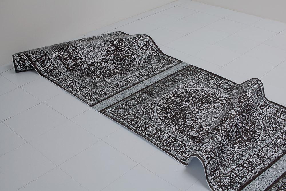
One of the works in the show is a large paper scroll of digitally printed carpets titled Contemporary South Asian Art (Conflicts of Perceptions | Oh hey she’s just too mainstream!). Its cheap, papery, black and white materiality reflects the reproduction of stale concepts of culture, while its title points towards a situation of being caught between competing expectations: expectations of “native” culture, colonial culture, family culture, migrant culture and art-world culture.
Neutral Ethnicity uses the Canadian $100 bill as a repeated motif across a large wall and a warmup tracksuit. The head of a scientist on one side of the bill has been digitally erased throughout—pointing to the 2012 Bank of Canada scandal that scrapped the image of an Asian scientist from the bill due to focus-group concerns that “the inclusion of an Asian without representing any other ethnicities was seen to be contentious.” (Bank head Mark Carney later apologized for the scientist being changed to a more Caucasian look, stating, “efforts by the bank note designers to avoid depicting a specific individual resulted in an image that appears to represent only one ethnic group.”)
As with her paper-carpet scroll, Mehra’s use of repetition in Neutral Ethnicity suggests the wide reproduction of stereotypes, and the work evokes a feeling of (legitimate) anger with the fact that Caucasian is perceived by many as being a “neutral” ethnicity in Canada, while all others are perceived as “not neutral.” Still, the title of the tracksuit work—Neutral Ethnicity (I guess the money should’ve changed him, I guess I should’ve forgot where I came from) also hints that personal dimensions, withheld from the viewer, are at hand.
Mehra’s practice articulates and resists competing cultural expectations, tests their limits and underlines the frustration generated in trying to do that work. Throughout the exhibition, Mehra sets up tensions between artworks and their titles, emphasizing differences between perceived and intended meanings. This strategy also suggests that one may never truly understand the particularities of another’s experience.
In fact—particularly in the works beyond Neutral Ethnicity and Contemporary South Asian Art—Mehra’s approach also set me as viewer and critic on a self-conscious edge by resisting easy interpretation. At times I felt too much opacity in her approach, but that feeling may reflect my own desire to understand and control information I am presented with. Certainly, Mehra put questions of language and power front and centre—touchy issues for any critic.
The show opens with six prints of sizzurp (!) and ink on watercolour paper. Each bears a brief, all-caps text and a distinctive title that together reads as a mix of general medicine and specific unease. The print reading “HOW MANY MILES TO EXCLUSION” is titled We don’t stand in line, borrowed showed hurt your feet OR To India and back: Why we must not give up, while the print reading “LEARN TO FADE IN” is titled Striving toward enhanced linguistic tolerance (an Opening of opportunity).
Two large wall texts are also present; one reads “GET OVER IT” in all caps. Another in Comic Sans says “Less Challenging Linguistic Prey.” I later learned (via Google) that “less challenging linguistic prey” is a phrase used in the book Beyond Ebonics: Linguistic Pride and Racial Prejudice by John Baugh. Baugh uses the term in relating a childhood episode in which he attempted to use language, both successfully and unsuccessfully, as an assertion of power. What he found is if you use the language of those in power, they may think you are deferring to them, even if you are not. At the same time, it might be possible to use that language to jockey for position over peers. The resultant evocations of the piece, on reflection, were of being trapped and misunderstood, of attempting to navigate a complicated and unfair reality. I also wondered how much Mehra feels that a temptation to adopt certain languages of art-world power—conceptualism, say—has influenced her work.
The final work in the show is a neon piece—a red rectangle bisected by a wavy line, with a circle on the lower half. Looking at the work first produced, for me, the impression of an unknown flag, while the title A Brown Woman Drowned generates a more specific, sobering and troubling effect.
Overall, Mehra’s work reminds me that there are vast gaps of understanding and fairness that occur within and without different communities, and that these gaps can lead to much emotional upset and tension—not to mention memorable and far-reaching errors on the part of the Canadian government and other institutions.