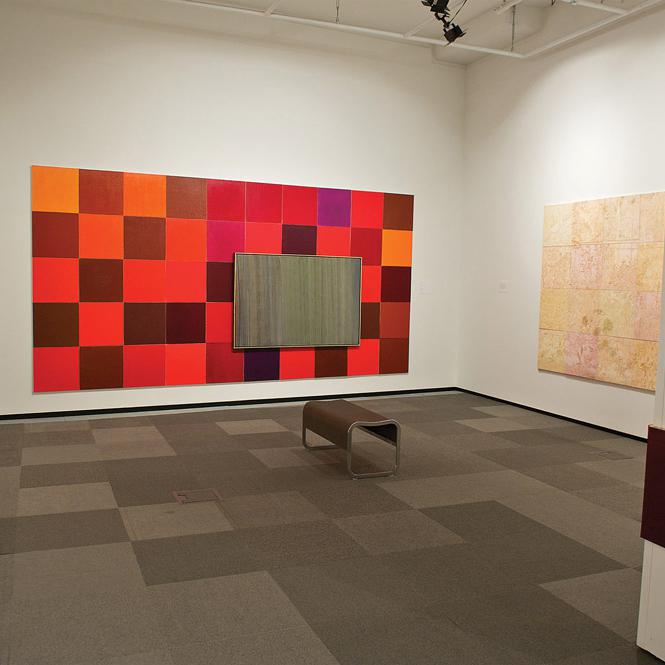
 At left: Arlene Stamp, From the Collection, 1988. Oil on canvas, 2.28 x 4.57 m overall. Inset: William Perehudoff, Untitled, n.d. 109 cm x 1.67 m. Right: Arlene Stamp, Plato and My Garden II, 1990. Oil and egg medium acryloid and graphite on canvas, 1.83 x 2.74 m. Photo: Dave Brown.
Nickle Galleries presented a comprehensive overview of Arlene Stamp’s 30-year practice with an impressive inventory of paintings, drawings and installations. Stamp’s art is a synthesis of her artistic inspirations and mathematical concepts. She obtained her degree in mathematics before earning a second degree in fine arts and the influence of these two disciplines shows in her art.
Upon entering the exhibition, visitors stepped onto a work called Plaza (1991), a complex geometric installation of black-and-white vinyl tiles that Stamp designed by offsetting overlapping grids. As with most of the works in the exhibition, a single idea produced multiple perspectives. In The Lost Painting Series (2001–02), Stamp enlarged details of a single coloured slide, the only remaining evidence of a lost painting she made based on the work of Saskatchewan artist Gladys Johnston, to create a suite of blurry abstract paintings. When Stamp realized that this series could yield endless results, she produced a limited-edition paint-by-number Lost Painting Recovery Kit (2001) that now allows others to reproduce parts of the lost original.
The chronological centerpiece and highlight of the exhibition was The RedWorks series. In 1987, Stamp embarked on a five-year investigation into the colour red as manufactured by Lefranc and Bourgeois. With these various reds, she created 192 monochrome paintings and multiple volumes of sketches and notes that documented her research. The Nickle’s selection included three related multi-panelled installations and three diptychs. The diptych titled Representing Red (1995) was a hinged, two-panel painting inset into a corner of the museum. One of the panels was painted with a suede-like surface of iron oxide; the other was mirrored. The name of the paint, oxyde de fer, was written repeatedly in block letters on the edges of the painting. Stamp presented red as a sum of composite parts: painted surface, reflected colour and the paint-colour pigment name. These various qualifiers support how this work is decisively read as red.
Over the years, Stamp’s art has assumed many forms as she has distilled subject matter into data and syntax. At times, her results have been materially based; at other times they have been more conceptually driven. Consistent throughout Stamp’s art is an elegant use of pattern and repetition combined with her commitment to an intuitive handling of materials.
This is a review from the Spring 2014 issue of Canadian Art. To read more from this issue, visit its table of contents.