This is an article from the Summer 2015 issue of Canadian Art.
An exhibition in October 2014 at the Olga Korper Gallery presented an occasion to commune with forms that could only have been issued by Robert Fones’s hand. The cycle of works adopted seemingly disparate motifs: cell atrophy, handwriting, polar exploration, adages of the life cycle and John Milton’s thoughts on the freedom of the press. On close view, they displayed profound symbiotic affinities, elegantly drawn and painted with Fones’s signature attention to detail.
As an artist, writer, curator and design teacher, Fones’s eye is always on form—a multivalent word, both noun and verb, with meanings in philosophy (Plato’s ideal forms), in botany (the taxonomic rank below variety) and in printing terminology (multiple page elements assembled together for a plate on a press), to name just a few branches of its tree.
Some specific forms that have garnered Fones’s interest over the years include tree species, butter wrappers, fields, highways, rivers, glass patterns, industrial trademarks, wallpapers, advertising symbols and viruses—mixed cultural and natural artifacts. As proof of his obsession with the genealogy of all forms, he remembers writing the following for a mail-art project circa 1975: “Continuous Forms / Continuous Forms / I am sending Continuous Forms / My name is Robert Fones / I am a Continuous Form.” The chain of thought underscores a continuum that runs from his creative output to the naming convention that classifies his person to his own being as a type inscribed within a larger pattern.
Fones’s integrated understanding of disparate fields exemplifies an autodidactic sensibility, iconoclastic enough to have qualified him for the title of “PhD in Anthropomorphology” from the infamous Rochdale College in 1972. During this time, he also published an artist book called Anthropomorphiks (1971), exploring his fascination with the interplay of the animate and the inanimate evident in the evolution of trademarks such as the Michelin Man.
The impulse toward a self-designed course of study seems to have taken root as early as his high-school years, when he was a prolific self-publisher of hand-drawn, typed and painted books featuring cartoons, wordplay and absurd narratives that parodied the paperback form. In a treasure trove of early literary efforts now housed in the AGO archives, an unfinished manuscript titled Letters I’ve Known and Loved: The Life and Legend of the Alphabet (ca. 1965) announces the seed of what has subsequently turned into a life’s work.
In describing Fones’s matrix of interests and capabilities, an apt analogy seems to present itself in what Canadian poet and typographer Robert Bringhurst calls “a typographic mind,” defined as “just as alert to the invisible as to the visible. It is a mind with at least four feet: one in the visual, one in the manual, one in the lingual and one in the logical.”
Yet an important distinction must be made: Fones makes strange the very structures of definition that the typographer employs. Complicating typeface designer Eric Gill’s pronouncement that “Letters are things, not pictures of things,” Fones’s letters often serve the paradoxical function of both. In his series of large-scale three-dimensional sculptures such as Rauschenberg S/Grande Parisienne (1997), the letter, in this case an “S,” sets the bounds of the frame and defines the photographic picture plane. Where typographers through time have held very polemical views (and easy recourse to pamphleteering to express these), Fones seems to hold a more open position, eschewing emphatic definitions. The ambiguous quality of the forms matches Roland Barthes’s championing in his lectures on The Neutral for a use of language that would counter popular culture’s way of pigeonholing definition, by inhabiting paradox instead.
Fones’s sophisticated plays on legibility seem timely now in relation to the ways of seeing promoted by popular digital cultures that trade exclusively on the face value of images. Counter to the stylistics of WYSIWYG (what you see is what you get) software, Fones’s work demands studied engagement and insists that there is always more to see. The ambiguity of a two-dimensional plane appearing to reproduce three dimensions is given frequent consideration. In the Leviathan (2008) works, letters appear to float in space convincingly. And in his Words in Niches Paintings (1994), it is the elaborate illusionism of relief sculpture that is evoked.
Where Fones melds photography and letterforms, the visual register contains even more to decode. In Three Eszetts (1992), a continuous photograph is portioned out across three different frames constructed according to varying weights of the German character. The object figured in the image is difficult to decipher, but one clue is the company insignia punched into the metal. It’s recognizable as the twin stick figures of J.A. Henckels (registered with the Cutlers’ Guild of Solingen on June 13, 1731, under the sign of Gemini). While the company is widely known for its household knives, what features in the photograph is an artist’s tool, a chisel whose handle is not visible within the frame. These originally handcrafted tools are now mass-manufactured, though returned to hand function by today’s consumers in kitchens and artists’ studios. Fones remarks: “Aside from fingernails and teeth—the body’s own built-in tools—hand tools represent humans’ first step in using things in the world to get what we want. But our use of tools is so automatic that we rarely stop to analyze what we are doing or to ask how these labour-saving devices got into our hands.” Carrying one of the oldest trademarks in the world, the chisel selected is itself a picture carrier. Observing the strata involved in the constitution of Fones’s artworks, curator Louise Dompierre dubbed him “an archaeologist of the present.”
In the recent Olga Korper Gallery exhibition, the artist’s handwriting, both past and present, is set into conversation. The alphabet is an agreed convention, a standard that has been naturalized by all its users. The result is that handwriting is a cultural practice that reflects both historical continuity and personal biography. Fones exhibits a great deal of skill in mediating between the larger strokes of history and the minutia, the less visible details. This interest has resonance with Greg Curnoe’s concern for describing place by its more hidden histories. In Curnoe’s artist book Deeds/Abstracts, which traces the history of his London, Ontario, home back through the ages, he wrote: “I have felt the power of many details adding up to an understanding of the ground I am standing on.” Curnoe, an early influence on Fones, was closely involved in observing the landscape around him. Fones has carried out his own distinct forms of cartography, including a map of butter specimens of Ontario as well as range maps of individual tree species. As an individualized craft, governed by other larger conventions and aspirations, handwriting is also a type of map, charting a person’s subjectivity, their physical trace and their cultural conditioning.
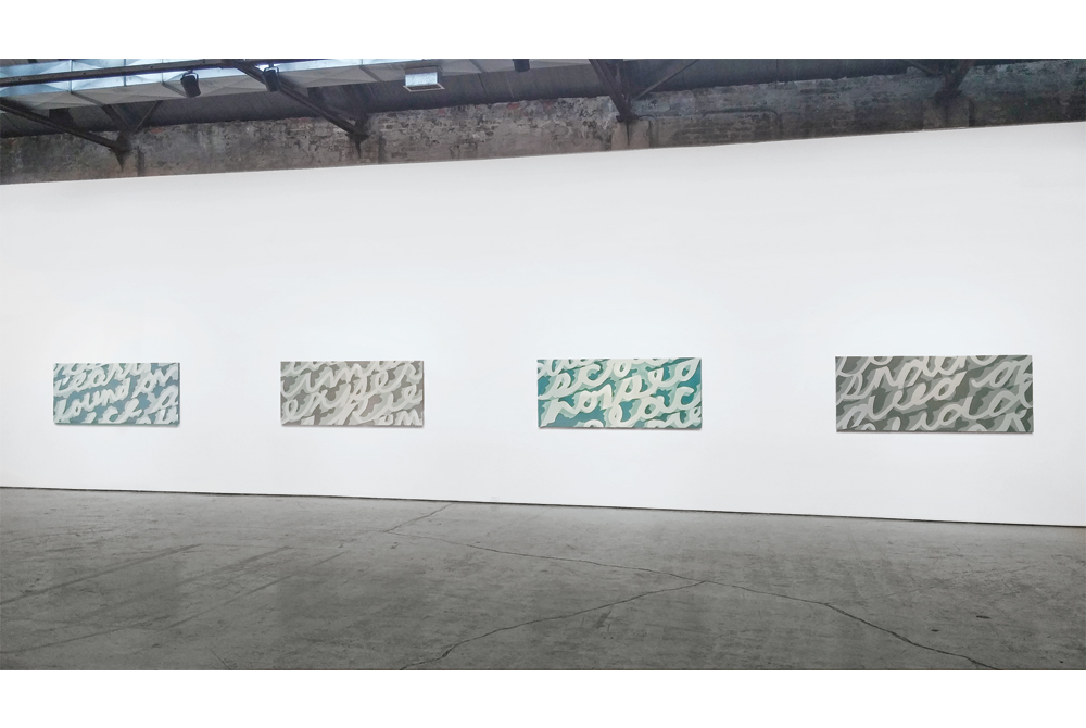
In the Polar Explorers (2014) series, Fones mines notes recovered from his primary-school social-studies lessons, extracting phrases such as “Shackleton died of a sudden heart attack” and “Scott hoped to reach the pool.” Carefully blowing up, tracing and painting his schoolboy’s handwriting to signboard scale, he treats his own script as an ethnographic object bound by a specific manufacturing process. The recorded lessons reflect the pedagogical priorities of the day, while the handwriting indexes a moving subject, now the distant but knowing observer of a former self. Text fragments are presented in parallel bands determined by x-height of the characters, and with all ascenders and descenders cropped out, the lines are set in tightest proximity. These bands cut diagonally across the picture plane, landing certain letters off the edge of the canvas. Though we may partially recognize the words given in the title, peripherally ingesting them as one would in a fleeting scanning of a page, the framing decisions tightly constrain access to legibility, effectively rendering language into image. Though abstracted, something of the flavour of the original lessons remains, invoked by the colour palettes and contours that resemble moving ice floes.
Tectonic formations also appear in the acrylic-on-canvas series Apoptosis (2014). These interlocking shapes conjure archipelagos. Or are these islands in fact on the verge of turning into letters? Turning his attention to the process of apoptosis, the mechanism by which cells are programmed for destruction, Fones’s interest in natural topography is revealed within the landscape of the body. Both in nature and in culture, forms constitute themselves through interdependence. In art, the visual trope of figure/ground depends on the interaction of positive and negative space. In biology, symbiosis traditionally described both the beneficial and antagonistic codependency between organisms. Apoptosis is a design function based on attrition, a kill order that paradoxically operates also as a structuring device, the chisel in embryonic development that frees fingers and toes from an undifferentiated mass of tissues.
Growth and decay by the same engine is also the mechanism proposed through two 68-inch-diameter circular canvases, we could live forever (2014) and something will kill everything (2014). These imposing pronouncements about living and dying are inscribed by an idealized version of Fones’s current handwriting. The two versions of his writing suggested two different time markers transposed, in a way similar to how Fones has integrated objects from two separate periods in previous works. In these canvases, collectively referred to as Engines of Life, he standardizes the form of his writing, creating a fixed character map in which each letter is defined and repeated systematically by a sort of mechanical logic. The picture plane is divided into swirling pie forms, with the adages repeating in perpetual circuits, moving in opposite directions like the double helix of DNA. These spirals are driven in alternating directions by the force of a motif that Fones observed in an illuminated version of the Book of Revelations. In that context, the cyclone-like emblem hovers at the top of the page, suggestive of an omniscient force, but the design has also been frequently employed in logo marks to designated physical dynamism. Hung side-by-side, Fones’s two circles are the flip faces of a clock—one set to the forward march of time while the other moves counterclockwise in a science-fiction fantasy of time-travel. Depending on one’s philosophical stance, one prospect may seem more horrifying than the other.
In a series of small watercolours on paper titled From Areopagitica (2014), Fones has divided into smaller segments the following textual fragment from Milton: “First, when a city shall be as it were besieged and blocked about, her navigable river infested.” In the originating text, the poet compares censorship to the encroachment of a disease on the body of knowledge. Such battle metaphors are also frequently invoked when we speak of illness and in the context of the Engines of Life canvases, Milton’s words could be seen to apply just as well.
The two metaphors are structurally the same while addressing a different adversary. Modernity has brought about sophisticated imaging of our diseases, and new ways of reading the genetic codes that underwrite certain ailments. The human genome project, as the world’s most comprehensive collaborative biological project, now brings the mapping of bodies into view by cracking codes. Is DNA not a type of expansive alphabet, a textual equivalent to our selves? If so, then Fones’s long-standing involvement in letters has found new urgency.

