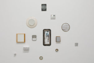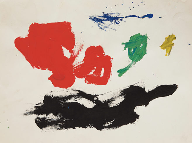
Picture the Seine River as it serpentines through Paris. Interspersed along the banks of the river are bouquinistes, the people who sell second-hand books out of large, green, metal boxes. In his recent show at Jessica Bradley Gallery—“Four Notable Booksellers”—Derek Sullivan appropriated the display techniques of the Seine bouquinistes. To this he introduced his vision of Modernism: one entrenched in geometric abstraction and formalist design. But above all, it was a show about the lure of adventure that one experiences when poring over used books.
Sullivan’s work unfolds like any good book should—by establishing a tight narrative, then twisting it unexpectedly. In the installation Four Notable Booksellers (2013), a skeletal wooden frame supports four green boxes, each containing a different theme: defeat in sport, British mathematician Alan Turing, contemporary art in Toronto and abstract painting. The books inside have been stripped of their original covers and replaced by Sullivan’s own, often cryptic, visual syntax. The cosmology of subjective responses to the work allows the viewers to pick and choose meanings based on their personal interests and history; it’s something that speaks to the importance of bookselling, to the idea of circulating knowledge among the public, perhaps because it’s emblematic of democracy itself. The bouquinistes’ role in the French Revolution and resistance movement during the Second World War provides a telling example.
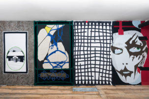
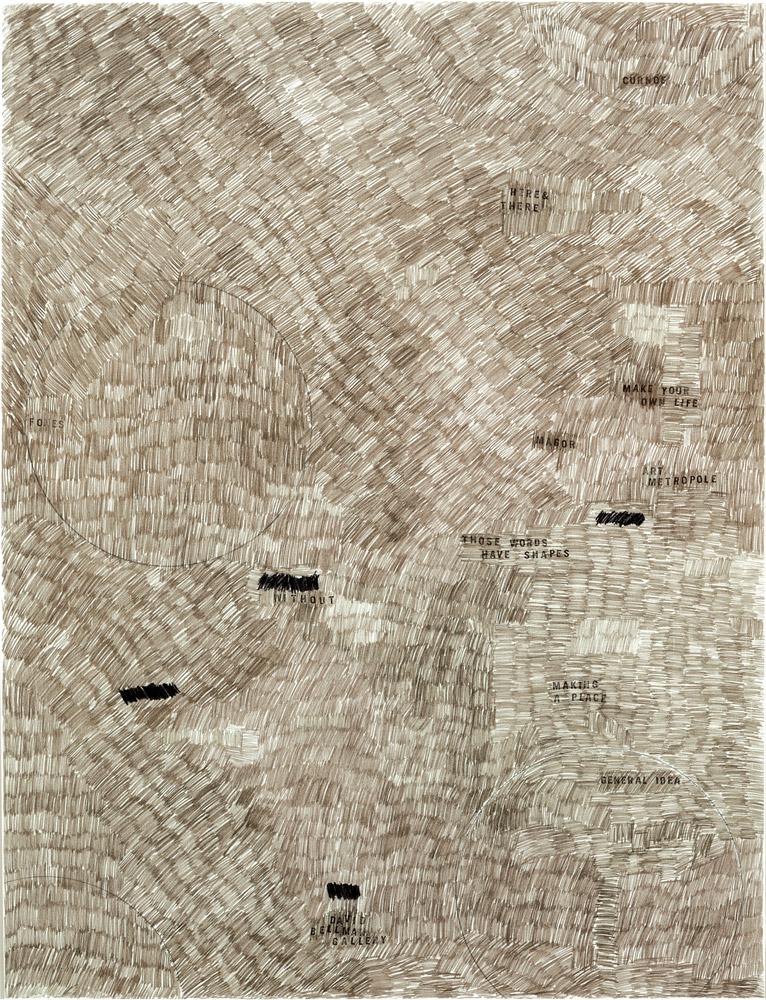
Opposite the installation, five drawings hung on the wall. The centre drawing, #95, A Man for all seasons (2013), is a portrait of Alan Turing repeated on one of Sullivan’s book covers. In effect, it pays homage to the scientist who cracked the Enigma code and was persecuted in the 1950s for engaging in a same-sex relationship. Many of Sullivan’s drawings characterize his preoccupation with geometric abstraction; others are soothing gradations from light to dark. All, however, are executed in a one-inch straight line—a dash—which has become Sullivan’s graphic signature.
The remaining text-based works represented a departure from Sullivan’s Modernist underpinnings, moving into the typographical Conceptualism of Lawrence Weiner. In Problems That Arise From Continually Confusing Left & Right (2013), the viewer/reader was activated through written language and thus opened to interpretation. Here, as elsewhere in the exhibition, Sullivan tendered instances where the audience negotiates their own subjectivity. Furthermore, he offered a rigorous and penetrating engagement with the subject of reading itself as both a concept and an object. The only thing missing was that distinct smell of old books.
This is a review from the Spring 2014 issue of Canadian Art. To read more from this issue, visit its table of contents.