Exhibitions focusing on designers can be tricky. Sometimes they come off more as PR for a firm or brand than an opportunity to learn about a creative talent or practice. On the flipside, sometimes the needs of a designer’s clients are so foregrounded that a sense of their personal expression is lost.
Luckily, Stefan Sagmeister’s “The Happy Show,” opened last week at the Design Exchange in Toronto, offers a refreshing take on the design-exhibition trope.
Linked by bright-yellow hues, handwritten wall texts, interactive activities and frequent personal disclosures—not to mention some of the remarkable real-world typography projects for which Sagmeister may be best known—“The Happy Show” pretty well pulls off the trick of making a major design celebrity seem at once accomplished and accessible.
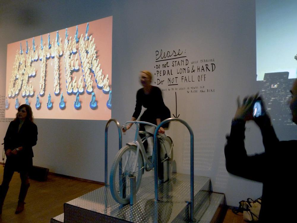
The New York–based Austrian designer shows rather little here of his award-winning work for clients like the Rolling Stones, OK Go, David Byrne and Lou Reed. Instead, entering the show, one encounters a series of gumball machines numbered 1 through 10. Viewers are asked to take a ball from the machine that reflects their personal “happiness rating.” (Sagmeister himself said at the opening that he was feeling around “7 or 8.”) Around the corner, sculpted hands proffer some of Sagmeister’s favourite ginger candies for the taking—a hit of “Stage 1” happiness, or pleasure. Riding a stationary bike lights up a message in a large neon sign: “Actually Doing the Things I Set Out to Do Increases My Overall Level of Satisfaction.”
Clips from Sagmeister’s upcoming feature documentary on happiness, as well as details in his Sharpie-penned wall texts, reveal a bit of why the designer chose to pursue happiness as a topic. Along the way, he touches on the death of his mother and father, his development of a chronic illness, his history on the addictive-substances front, and his anxieties about approaching women. Discussions with some of his therapists are included, as are excerpts from his experience at a meditation retreat.
In some cases, to be frank, these revealed details (and some of personal downfalls they hint at) may fall into the “Did I really want to know that about my design hero?” category. But one also appreciates that Sagmeister is trying to be frank, acknowledging that his interest in the topic isn’t just intellectual or design-related—and Lord knows, he could have easily gone that route with very little viewer outcry.
Interestingly, personal journeys aside, it is Sagmeister’s remarkable typographic projects which remain the highlight of the show. In one film, real-world materials such as coffee cups, jello and creamers spell out the phrase “Now is Better.” In another, bamboo sculptures that read “Keeping a Diary Supports Personal Development” are floated down a river, dragged along a sidewalk and poised on the edge of a building. And in a sequence related to his upcoming feature, young Balinese dancers use small banners to convey the saying “Make the First Step.”
In these typography projects, Sagmeister takes immaterial concepts and terms and brings them into the material world, enacting them in at least one concrete way. As in the work of BC-based designer Marian Bantjes—who has a collaboration with Sagmeister on view at the DX, and whose work was also shown in Toronto in 2011, at OCAD—there’s also a delight, happiness or pleasure the viewer experiences at seeing these messages take shape out of mundane everydayness.
The exhibition reflects a new direction for the Design Exchange that its leaders hope will make it a happier operation as well. Rather than focusing on the promotion of Canadian design, as was its mission in recent years, the institution has reoriented to promote “the experience of design” by “offering exhibitions and programming with broad public appeal” that include “renowned traveling exhibits from prestigious cultural institutions across the globe.” (This show is from ICA Philadelphia, while in June, the DX will open an exhibition on Christian Louboutin from London’s Design Museum.)
Like the designer himself, this exhibition isn’t perfect—there are many more insights out there on happiness than are covered in the show, to say the least. But the show’s bright yellow walls and playful approaches provide a welcome contrast to grey, overcast skies of both the mental and meteorological variety.

