“More Than Two (Let It Make Itself),” opening at the Power Plant on September 20, is an exhibition comprising more than 200 works by more than 100 Toronto-area artists and artist teams. Curated by artist Micah Lexier and presented alongside a solo show of his work, it is quite possibly the most extensive exhibition of local art undertaken here in decades. In terms of numbers of artists and works, that is; in terms of space, it occupies just one largish gallery, with all of the works contained by a series of 30 custom-made vitrines.
Lexier undertook the exhibition in response to an invitation from art critic Sarah Milroy who, in 2011, was the recipient of an award from the Toronto Friends of the Visual Arts. Milroy took the cash prize that came with the award honouring her work and offered it as seed money for an exhibition of emerging Toronto artists, inviting Lexier to be the curator. Milroy is determined to give something back to the Toronto art community, and hopes the project will address what she sees as a core lack of definition in the city’s art scene. While art practices in Vancouver, Winnipeg and Halifax are readily characterized by key individuals, landmark events and recognizable sets of formal issues and thematic preoccupations, there is no consensus about the Toronto art milieu. As a young critic just starting out, Milroy found it very difficult to learn what characterized Toronto art, and found there were few documents to help her make such an assessment. All these years later, she feels that such a definition is still elusive.
Her objective—hope may be a better word—is for “More Than Two” to provide a mirror of Toronto’s art scene that leads, if not to the desired definition, then at least to a recognition of its absence. She nominated Lexier as the curator because, in her life as a journalist, he has been a reliable informant, consistently insightful and precise. She also admires his previous curatorial efforts, finding them generous and astute, particularly with regard to emerging or lesser-known artists.
Milroy also pitched the Power Plant on producing and hosting the exhibition. This was done, quite literally, on the fly—in the departure lounge at Billy Bishop Toronto City Airport, where she just happened to bump into Gaëtane Verna, the Power Plant’s then-new director. With the concept no more advanced than what she had initially discussed with Lexier, Milroy described the project to Verna, who immediately saw its potential. With Lexier’s hyper-connectivity to the Toronto art world, his exhibition seemed to Verna tailor-made to address the issue. She was also aware that, despite his ubiquity in local art circles, Lexier had never been included in an exhibition at the Power Plant. After meeting, they arrived at the structure of “One,” “Two” and “More Than Two.” (“One” is composed of three solo works by Lexier and “Two” includes three works on which he collaborated with three different writers; both are curated by Verna.) It may be the first time in its history that the Power Plant has turned over all its gallery spaces to a single artist, and it fits with Lexier’s nature that he chose to share them with more than 100 other artists.
Early in his research, Lexier realized that this was a chance for him to really be a curator—to venture outside of expectations and beyond work that was like-minded or reflective of his own artistic concerns (as was his approach in earlier curatorial ventures). Nonetheless, he did not take on the burden of representing Toronto. With a mandate to focus on emerging artists as framed by the initial invitation, he wasn’t working “for the history books,” as he puts it. Despite this, as he progressed through his first round of studio visits, he decided it was important to place the work of these young artists within a larger context of professional and aesthetic relationships. With this as its framework, this exhibition may not resonate in the history books, but it will provide a cogent and compelling image of the current state of a continuum of concerns that is intricately woven together across generations of local artists.
So what are these common concerns? “Let It Make Itself,” the show’s subtitle, was Lexier’s guiding principle and the dominant aesthetic tendency he found driving the work he chose for the exhibition. To quote from his draft curatorial text for the Power Plant: “It was the idea of the artist becoming attuned to what a certain material, artwork, or exhibition even, wants to be.” Let’s skip over the part about the art having its own intention and look at how subtly these works match process to material and form, which is the formal quality I think the phrase implies.
Joy Walker’s Outline (2011) is a perfect example. A rectangle of cloth has been marked with a thin line of ink just inside its torn edges. Despite a precise and delicate application, the ink bleeds out into the thread, revealing the warp and weft of the cloth. The gesture is so spare, so seemingly casual, that it risks invisibility, and yet says something fundamental about the nature of its material and the character of its support. Kristiina Lahde’s material study for Holes, Burnt Paper (2011) is similarly spare and controlled. Folded and burned to create a simple pattern, it is reminiscent of elementary-school paper snowflakes. With its casual posture and mundane associations in the foreground, the charred work lays bare the dark power and beauty of fire.
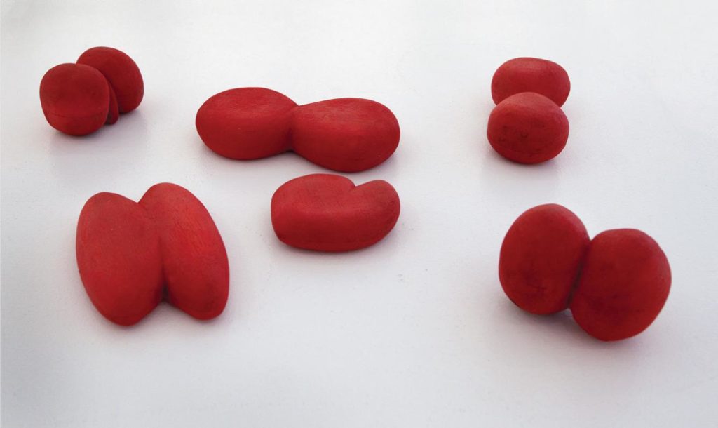
Unabashedly, Lexier admits that he chose works that are, in one way or another, beautiful objects; rationalizations and connections to other works came later. It could be pleasure enough merely to enumerate the variety of ways in which these simple, elegant objects achieve their unique forms of beauty. Kai Chan’s Balls (1993–2012), for example, are almost palm-sized, with soft, matte red surfaces. Roughly bifurcated and sponge-like in appearance, they just beg to be grasped, squeezed gently, caressed. Perhaps it’s a cliché to say the craft world produces this intense sense of tactility. Known for his delicate touch in a wide range of forms and materials, Chan is one of the more senior participants in the show, but he’s not alone in eliciting this sensory appeal, which links him to many of the younger artists. Beth Stuart’s untitled porcelain chain readily evokes a sense of the artist’s deft fingers adroitly forming each delicate link from soft paste—a sense contradicted by the known brittleness and fragility of the material, and contradicted yet again by the work’s form, with the implied strength and flexibility of a chain. It seems almost necessary to handle the work to confirm these impressions.
But beauty first, then rationalizations and categories. True to his habit of sorting and classifying things, Lexier identified several unofficial categories for the objects in the show; among them are “process,” “material,” “shape,” “sticks,” “collections of things,” “anomalies” and “something new for the show.”
“Process,” of course, is the idea that the work makes itself, and also includes tools, material studies and models, of which there are many examples. In this spirit, Kim Dorland’s paint-mixing palette is an actual palette loaded with an enormous quantity of paint (abandoned in the process of making another painting), though in size and colour it seems a thoughtful companion to his Her #8 (2013). Conversely, Jonathan Sabine’s Hex Tools (2013) are not actual tools but a whimsical set of objects he created to exorcise the mechanical preoccupations of his design practice. Assuming the appearance of mysterious runes, they could also be in the “collections of things” category.
“Material” captures works that explore the physical and surface qualities of their constituent elements, so could include Katie Bethune-Leamen’s Blobs (2009–13): small, variously articulated lumps of earthenware or porcelain with an assortment of glazes. “Material” also seems an apt category for Dax Morrison’s 2008 series of photo paper exposed to carefully varied levels of light. Cameron Lee’s dilly dally (2010), a pickle jar inside a galosh—the rigid jar boosting the perversely floppy boot—also seems to fit here, unless it belongs with “shape.”
“Shape” is Lexier’s shorthand for work that focuses on its formal and graphic properties: Roula Partheniou distills this notion with Partial Cube (2013). A visual and material pun, the work neatly describes the difference between an appearance and the thing itself. “Shape” might also extend to details from Tom Dean’s Excerpts from a Description of the Universe (1984–86), exemplary formal objects welded to considerations of process and material.
“Sticks” are self-evident, though whether they share features with process, material or shape varies. Danielle Bessada’s Implement for Grazing (2010) is clearly a stick. Looking just slightly weather-beaten, it suggests an arcane discipline for herbivores, extracting maximum metaphorical value from its elegantly pared-down formal shape. It is, in fact, a found object repurposed as a drawing tool. On the other hand, Jonathan Scott’s composition of sticks, Neurath’s Boat (2013), loaded with symbolic allusions, fits more into the “material” category, or perhaps it’s a “collection” of sticks.
“Collections of things” is an equally obvious and varied category. Jeannie Thib’s Stack (2005) might better belong with “shape” while Laura McCoy’s work seems more derived from material considerations. Sandra Rechico’s L.O. Series (1995–2001), though it does not look it, is also a collection of things. Comprising all the leftover display materials from previous exhibitions, it is driven by process, comfortably straddling both categories.
“Anomalies” are works that seem to deviate from a particular artist’s known body of work and so applies only to those artists whose work is already well known. A viewer, for example, might well be surprised to learn that Coverup #1 (2012) is by photographer Geoffrey James.
“Something new for the show” arises as a category because, in the rare cases in which this occurred, Lexier didn’t know where an unseen work would fit. In other words, by the time the exhibition is mounted, this category is already obsolete.
In truth, I don’t really know where most of the works fit in Lexier’s breakdown (Lexier himself acknowledges the categories are hazy), and it is unclear whether any of these categories will affect the way the works are arranged in their vitrines. It seems unlikely and unnecessary, as slippery and imprecise as the classifications are. Lots of other categories could be (and probably were) devised to describe how one artwork connects with another. I suspect that visitors to the exhibition will come up with new and surprising sets of their own. Categories are, after all, useful tools for thinking about how works relate. The same might be said for the vitrines themselves. They’re a way of thinking inside the box, or, in Lexier’s words, they “unify and consolidate a vast array of disparate elements.”
This takes me back to Milroy’s quest for a capsule definition of Toronto art. “More Than Two” will certainly help engender a sense of form and place within Toronto’s immensely diverse practices, but will it lead to a definition? Such a definition may not be possible, or even all that desirable. There’s a strong part of me that resists the idea that these artworks could submit to such containment. The kind of wobblings and meanderings I’ve played with here are part of what keeps it interesting, surprising. Looking for a definition may be like pushing the proverbial boulder up the hill, doomed to failure. But it could be a great game.
This is a feature from the Fall 2013 issue of Canadian Art. To see more of “More Than Two (Let It Make Itself),” visit canadianart.ca/morethantwo.

