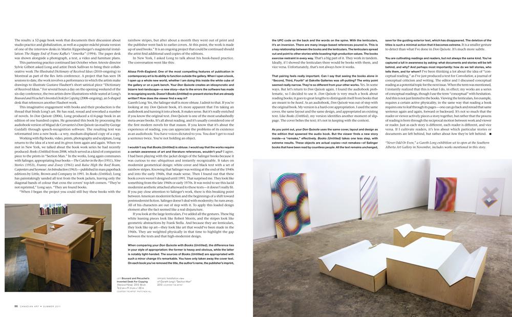
This interview with the Canadian artist Gareth Long began at the Kate Werble Gallery in Manhattan in 2009. Long was about to open his first solo show in New York, and he had agreed to give me a preview. The exhibition, “Section Man,” involved a series of large, colourful lenticular prints called Untitled (Stories) (2008–10). The works relate to the covers of four J. D. Salinger paperbacks, and their individual titles each carry the bracketed name of a character from one of these books. In the gallery, the tall prints leaned against the walls. As I moved past them, colours and patterned images jumped out with the illusion of three dimensions. Long explained that each print holds a series of slender vertical lenses that reveal and magnify changing perspectives depending on the viewer’s movements. The prints link Salinger’s characters and styles with the formal ghosts of 1960s American abstraction and minimalism, and together the works form another chapter in a practice that engages audiences with multiple readings—readings that can shift (quite literally) depending on the viewer’s position.
Born in Toronto and equipped with a degree in visual studies and classical civilization from the University of Toronto and an MFA from Yale, Long now lives and works in Brooklyn. In the past year, however, a couple of projects have brought him back to Canada. In early 2010, he was involved in a show at The Apartment in Vancouver, an aptly named apartment-cum-gallery-space that features a Lawrence Weiner work in the kitchen and has hosted projects by Luis Jacob and Matthew Higgs, among others. Director Lee Plested invited Long to use the space for a monthlong residency. In Vancouver, Long kept up a long-distance dialogue with the British conceptualist Liam Gillick—a mentor, colleague and friend who was in Martha’s Vineyard at the time. They talked art, and Long produced objects and a collaborative project for a 2010 exhibition titled “Who Invented the Desk?” The results: a 52-page book work that documents their discussion about studio practice and globalization, as well as a papier-mâché pinata version of one of the interview desks in Martin Kippenberger’s magisterial installation The Happy End of Franz Kafka’s “Amerika” (1994). The paper desk was shown alongside a photograph, a text, a video and furniture plans.
This partnering practice continued last October when Artexte director Sylvie Gilbert asked Long and artist Derek Sullivan to bring their collaborative work The Illustrated Dictionary of Received Ideas (2010–ongoing) to Montreal as part of the Res Artis conference. A project that has seen 18 sessions to date, the work involves a performance in which the artists make drawings to illustrate Gustave Flaubert’s short satirical piece “Dictionary of Received Ideas.” For several hours a day on the opening weekend of the six-day conference, the two artists drew illustrations while seated at Long’s Bouvard and Pécuchet’s Invented Desk for Copying (2008–ongoing), an S-shaped desk that references another Flaubert work.
This imaginative engagement with books and their production is the thread that binds Long’s art. He has read, reread and reworked a number of novels. In Don Quixote (2006), Long produced a 614-page book in an edition of one hundred copies. He generated this book by processing the audiobook version of Miguel de Cervantes’s Don Quixote (as read by George Guidall) through speech-recognition software. The resulting text was reformatted into a new book—a wry, medium-displaced copy of a copy.
Working with flip books, video, prints, photography and sculpture, Long returns to the idea of a text and its given form again and again. When we met in New York, we talked about the book work series he had recently produced: Books (Untitled) from 2008, which served as a kind of companion piece to the prints in “Section Man.” In the works, Long again communes with Salinger, appropriating four books—The Catcher in the Rye (1951), Nine Stories (1953), Franny and Zooey (1961) and Raise High the Roof Beam, Carpenters and Seymour: An Introduction (1963)—published in mass paperback editions by Little, Brown and Company in 1991. In Books (Untitled), Long has painstakingly sanded all text from the book jackets, leaving only the diagonal bands of colour that cross the covers’ top-left corners. “They’re not reprinted,” Long says. “They are found books.
“When I began the project you could still buy these books with the rainbow stripes, but after about a month they went out of print and the publisher went back to earlier covers. At this point, the work is made up of used books.” It is an ongoing project that could be continued should the artist find additional used copies of the editions.
In New York, I asked Long to talk about his book-based practice. The conversation went like this:
Alissa Firth-Eagland: One of the most compelling features of publication in contemporary art is its ability to function outside the gallery. When I open a book, I open up a whole new world, whether I am doing this inside the white cube of the gallery or on a park bench. Your Don Quixote creates an idiosyncratic and bizarre text-landscape—a new story—due to the errors the software has made in recognizing words. Doesn’t Books (Untitled) re-present stories that are already written? How does the viewer find a way in?
Gareth Long: Yes, the Salinger stuff is more obtuse. I admit to that. If you’re looking at my Don Quixote book, it’s more apparent that I’m taking an audiobook and turning it into a book. It makes sense. But it’s really enriched if you know the original text. Don Quixote is one of the most unabashedly meta-aware books. It’s all about reading, and it’s usually considered one of the first modern novels for that reason. If you know that it’s about the experience of reading, you can appreciate the problems of its existence as an audiobook: You have voices dictated to you. You don’t get to read a sentence twice. You’re not holding an object.
I wouldn’t say that Books (Untitled) is obtuse. I would say that the works require a certain awareness of art and literature references, wouldn’t you?
I agree. I had been playing with the jacket design of the Salinger books because it was curious to me: ubiquitous and instantly recognizable. It takes on modernist geometrical design: white cover and black text with a set of rainbow stripes. Knowing that Salinger was writing at the end of the 1940s and into the early 1960s, that made sense. Then I found out that these book covers weren’t designed until 1991. That surprised me. They look like something from the late 1960s or early 1970s. It was weird to see this lucid modernist aesthetic attached afterward to these texts—it doesn’t really fit. If you pay close attention to Salinger’s work, there is this breaking point between American modernist fiction and the beginnings of a shift toward postmodernist fiction. Salinger doesn’t deal with modernity; he runs away. All of his characters are out of step with it. To apply this loaded design element after the fact seemed like a real disjuncture.
If you look at the large lenticulars, I’ve added all the gestures. These big white leaning pieces look like Robert Morris, and the stripes look like geometric abstractions by Frank Stella. And because they are lenticulars, they look like op art—they look art that would’ve been made in the 1960s. They are weighted physically in that time to highlight the gap between the texts and that high-modernist design.
When comparing your Don Quixote with Books (Untitled), the difference lies in your style of appropriation: the former is heavy and obvious, while the latter is notably light-handed. The sources of Books (Untitled) are appropriated with such a minor change it’s remarkable. You have only taken away the cover text. On each book you’ve removed the title, the author’s name, the publisher’s imprint, the UPC code on the back and the words on the spine. With the lenticulars, it’s an inversion. There are many image-based references poured in. This is a key relationship between the books and the lenticulars. The lenticulars spread out and point to other stories while boasting high production values. The books exercise restraint in every way.
That’s a big part of it. They work in tandem. Ideally, if I showed the lenticulars there would be books with them, and vice versa. Unfortunately, that’s not always how it works.
That pairing feels really important. Can I say that seeing the books alone in “Second, Third, Fourth” at Oakville Galleries was off-putting? The entry point seemed really narrow. They’re so different from your other works.
Yes. In some ways. But let’s return to Don Quixote again. I found the audiobook problematic, so I decided to use it. Don Quixote is very much a book about reading books; it goes to great lengths to distinguish itself from books that are meant to be heard. As an audiobook, Don Quixote was out of step with the original book. My version is a hard-core appropriation. I used the same cover, the same layout and the same design, and appropriated an existing text. Like Books (Untitled), my version identifies another moment of slippage. The cover belies the text; it’s not in keeping with the context.
As you point out, your Don Quixote uses the same cover, layout and design as the edition that spawned the audio book. But the viewer finds a new story inside—a “remake,” effectively. Books (Untitled) takes one less step, with extreme results. These objects are actual copies—not remakes—of Salinger books that have been read by countless people. All the text remains unchanged, save for the guiding exterior text, which has disappeared. The deletion of the titles is such a minimal action that it becomes extreme.
It is a smaller gesture to detect than what I’ve done in Don Quixote. It’s much more subtle.
You are cultivating readings and readers, but not always the same kind. You’ve captured a lull in awareness by asking: what documents and stories will be left behind, and why? And perhaps most importantly: how do we tell stories, who tells them, and for whom?
I’ve been thinking a lot about the idea of “conceptual reading,” as I’ve just produced a text for Convolution, a journal of conceptual criticism and writing. The editor and I discussed conceptual reading as a potential topic for the next issue. When the term was mentioned, I instantly realized that this is what I do, in effect; my works are a series of conceptual readings, though I use the term “conceptual” with hesitation. And this is not just limited to the books. Viewing the lenticulars, for example, requires a certain active physicality, in the same way that reading a book requires one to leaf through its pages—one can go back and reread that same sentence again and again, forward or backward. It’s not so much that the reader or viewer actively pieces a story together, but rather that the process of reading is born through the reciprocal motion between work and viewer or reader. Just as each story is different, each reader is different, and vice versa. If I cultivate readers, it’s less about which particular stories or documents are left behind, but rather about how they’re left behind.
“Never Odd Or Even,” a Gareth Long exhibition set to open at the Southern Alberta Art Gallery in November, includes works mentioned in this story.
This is an article from the Summer 2011 issue of Canadian Art. To read more from this issue, please visit its table of contents.