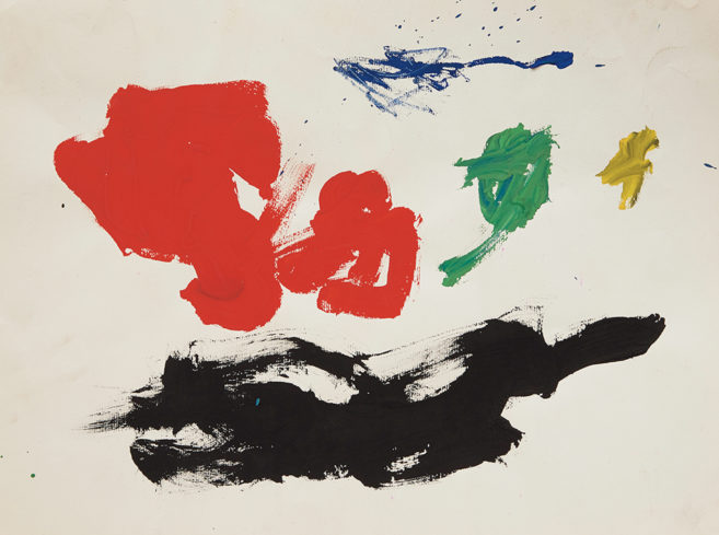
The last few weeks have seen reams of style-section stories about the “hot colours” for 2009. Pantone has picked “hopeful, reassuring” mimosa yellow for uplift in trying times, while paint manufacturer Sherwin-Williams has pegged four palettes for varying lifestyle trends: brights for technology lovers, earth tones for locavores, restrained purples for belt-tighted luxury and spicy hues for a globalized, cross-cultural mood.
Calgary artist Christopher Willard is himself a bit of an authority of colour, belonging to the Association Internationale de la Couleur as well as demonstrating considerable engagement with hue via his abstract painting practice. Several of his works on view at Herringer Kiss Gallery resemble colour palettes and spectra like those found in Adobe Illustrator or, prior to digital predominance, in colour theory manuals. Particularly vibrant are his diamond-shaped works that systematically yet poetically mix lines of narrowing colour.
But Willard also offers semiotic twists to some works, inscribing phrases like “Let this be a lesson,” “It isn’t what you think,” and “Impossible to overlook” into some of his colour grids. The result is strangely playful works that reframe both personal relationships and CMYK ratios with equal measures of efficiency and obscurity.
| <img src="/online/see-it/2009/03/12/willard2_448.jpg" alt="Christopher Willard Tikaku: Vicinity 2006 Courtesy of Herringer Kiss Gallery” style=”border: none; clear: none;” /> | |
|
Christopher Willard Tikaku: Vicinity 2006 Courtesy of Herringer Kiss Gallery |


