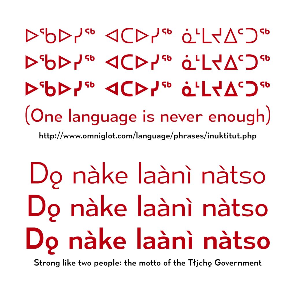
 Some samples of Indigenous language phrases rendered in the Canada 150 font. Image: via Ray Larabie.
Note to the reader: Given that Canadian Art serves general readerships as well as those specialized in art and design, the words “font” and “typeface” are used interchangeably in this article. For more on this approach, read this article from Fast Company Design.
Amid all the official plans for Canada’s 150th anniversary celebrations, in a relatively unheralded detail of visual branding, there’s a curious initiative: a custom typeface for party banners and t-shirts that includes, alongside characters used in French and English, characters for writing in the approximately 60 Indigenous languages used across this country.
As an alphabet is a set of symbols that combine to convey meaning, the dovetailing of Indigenous and settler alphabets in an official—and celebratory!—government-sanctioned font bears its own symbolism. And so, though the font is effectively party decor, its inclusiveness raises some serious questions.
Namely: What is the political value of visual identity? What responsibility do creatives bear in crafting a national image? How can a font play a role in reconciliation?
The font, itself called Canada 150, is touted on its government website as “unified,” and a representative from Canadian Heritage stated that its expanded character set “stands as a symbol of our commitment to inclusivity.”
What, then, might this font’s story tell us about that commitment?
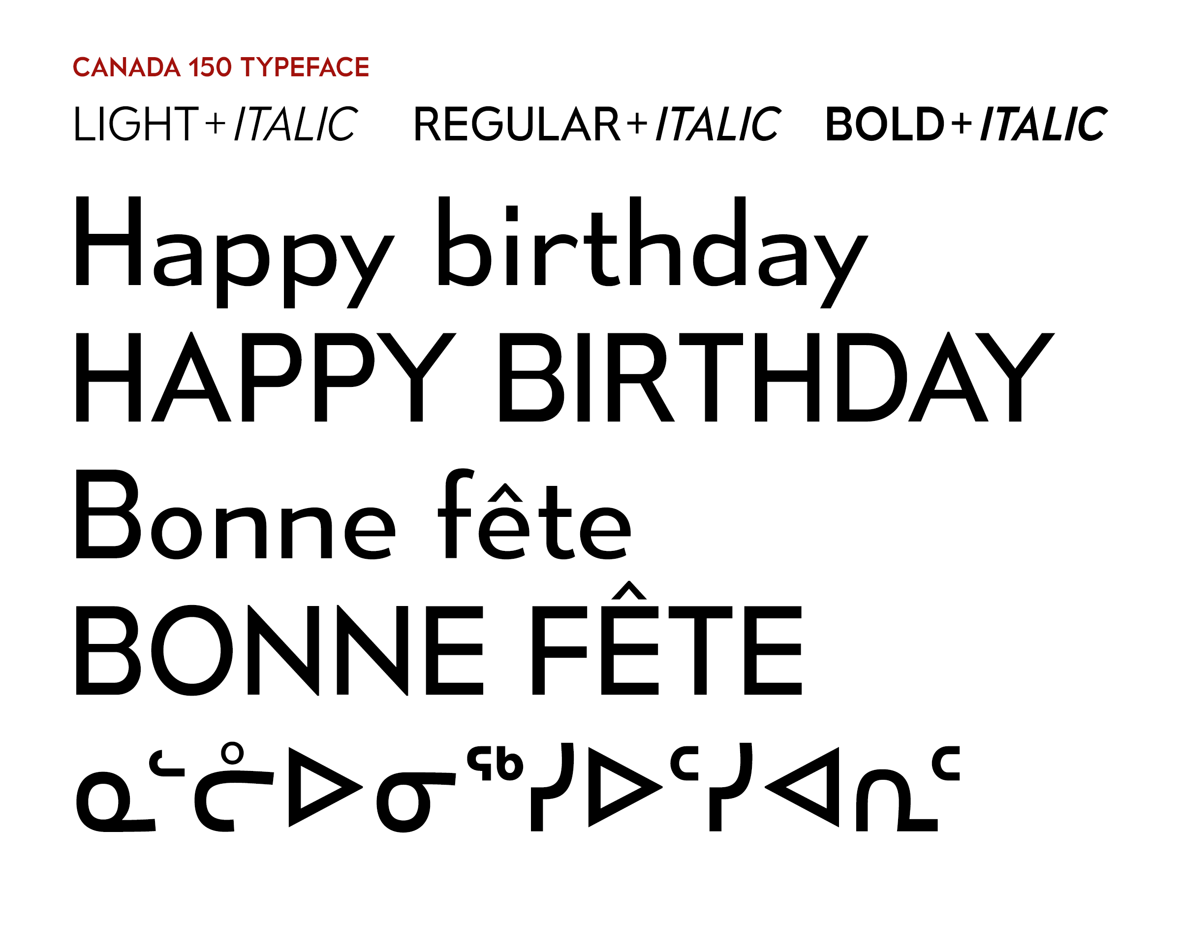 A sample of the Canada 150 font used to write “Happy Birthday” in different languages. Image: via Ray Larabie.
Genesis of the Canada 150 Font: “A One-Man Show”
As a font, Canada 150 is largely the work of an individual. Font designer Ray Larabie developed Canada 150 from a font he’d already made, one that the government identified as appropriate for its purposes.
That initial font, called Mesmerize, wasn’t about patriotism, just personal taste: Larabie explains that he’d had in mind fonts from the 1920s and 30s, but also that “I did it from my head.”
The Canada 150 font is characterized by a low x-height, which means the bulb of the lowercase b and the bar of a capital A, for example, fall pretty far down the letter. The points, like in Ms and Ns, are sharp, but those angles are balanced out by more organic lines; the C, for example, is “not perfectly round, it’s kind of this wonky shape, which is on purpose, because I wanted it to look a little more friendly,” Larabie says.
It’s been reported otherwise, but it was Larabie who proposed that Canada 150’s character set should include Indigenous languages. The government had only required the font to support French and English, and Larabie pitched the idea after his font had already been selected for the project.
“I just thought it would be a nice thing to do,” says Larabie of his motivation. “I felt weird that some people wouldn’t be included.” To him the inclusion was not a particularly pointed political gesture, just a no-brainer. “There’s so few fonts that support [Indigenous] languages,” he elaborates; “they’re left out so much.”
Officials were enthusiastic, but bureaucracy is plodding, so Larabie’s contact at the Canada 150 office encouraged him to go rogue to ensure the project happened.
“We’ll say it was your idea to throw [the additional alphabets] in,” Larabie paraphrases. And bureaucracy was not just slow, but nervous: the go-ahead came with “a little bit of warning” about potential fallout. Larabie remembers being told that, “if one language doesn’t get included by accident, then it becomes a political thing.”
The designer was undaunted, despite living in Japan (he’s from Ottawa) and conducting the entirety of his research online, with no pay from the government.
What he did have was bravado: “I just said: well I’m just gonna include all of them, and I’m not gonna miss any.”
Larabie’s subsequent effort was enormous; as Cree linguist Kevin Brousseau puts it, Canada 150 “was pretty much a one-man show.”
Brousseau, who heads several projects that promote Cree language use, was unsurprised to find a single mastermind behind the Canada 150 curtain. That’s how a lot of developments in formalizing language happen, he explained, noting that the first thesaurus in England was made by one guy with an obsession.
“I think it’s probably more the norm to have one lone designer who has an idea and runs with it, rather than a whole group of people or a committee working on these things,” Brousseau says.
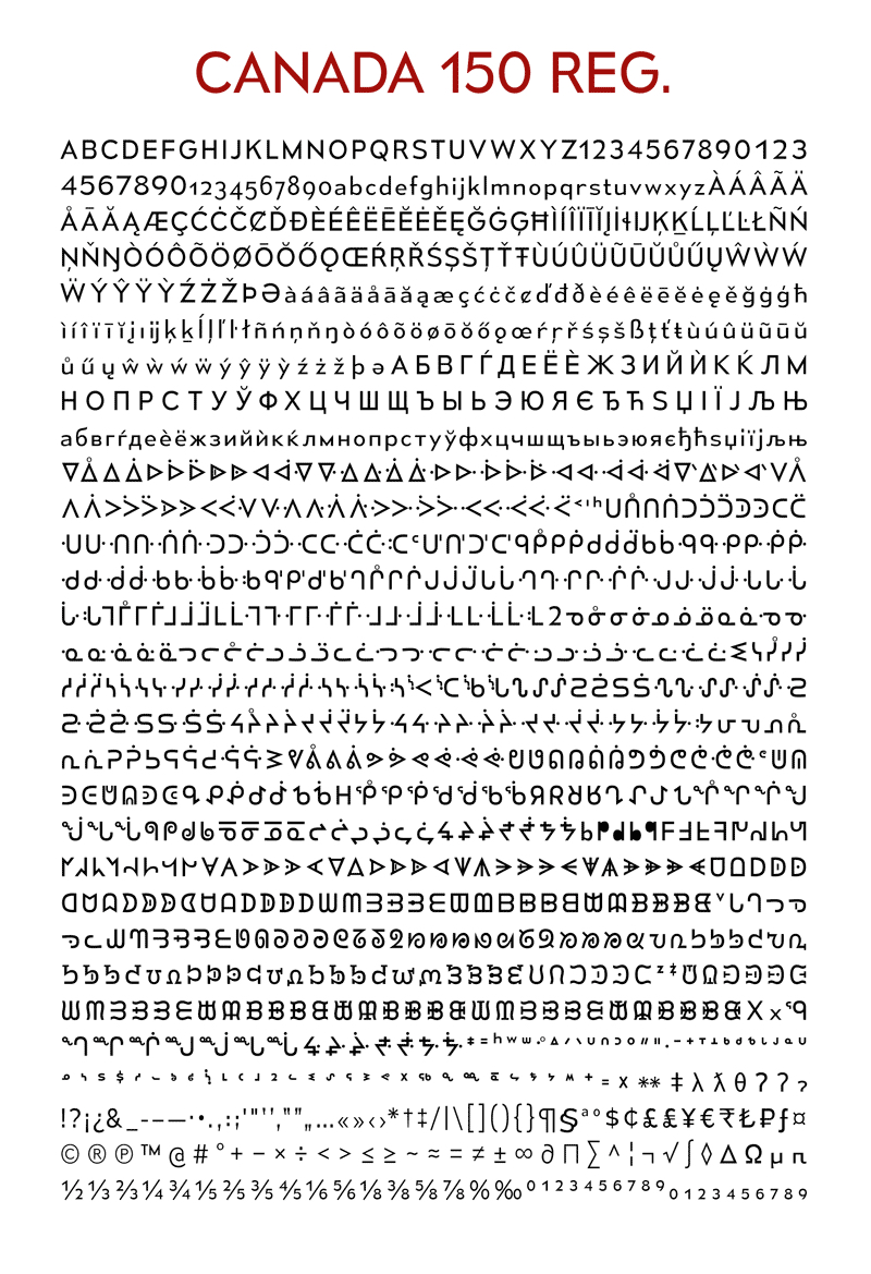 The full Canada 150 font set. Image: via Ray Larabie.
The Corrections: Making Unicode Work for Cree
Considering the conditions of Larabie’s labour, errors may have been inevitable.
Chris Harvey—“a linguist, primarily, who dabbles” in typography, and specializes in Indigenous languages—reviewed Canada 150 after its release and thought Larabie still might have missed some dialects. But he didn’t fault Larabie for the omissions: it’s a major investment to develop familiarity with all the alphabets of Indigenous Canada, and “you can’t expect a font designer to do that, you just can’t.”
Working remotely was also a liability, since those who speak a language are, of course, its ultimate experts.
Harvey, who designed fonts with many Aboriginal communities in the 80s, emphasized that only someone who uses a given alphabet knows when, for example, a flourish on a font stretches a character beyond recognition. And sometimes mistakes are worse than that: characters might face entirely the wrong direction and render whole words illegible, as was the case in Canada 150 with syllabics in a major Cree dialect.
That Cree-syllabics problem in Canada 150 didn’t stem from Larabie’s work, but from a glitch in the Unicode guide—the universalized digital template for all the letters of modern languages. Almost all contemporary fonts are designed with Unicode, and consequently the faulty Cree characters repeat in fonts found across all standard software.
This Unicode issue been a pain for Cree communities for years: locally designed fonts circumvent the issue, but can’t be used in communications like emails or Facebook posts. As Brousseau sums up: “Every time you want to write on social media, you’re trying to avoid the words that have the wrong characters…it’s been a big disincentive for people to write in syllabics online.”
When Brousseau saw that the Unicode errors had trickled down to Canada 150, he contacted Larabie, who in turn had a contact at the Unicode Consortium, and together they were able to push the corrections through.
The characters now appear properly on some software, while other programs have yet to roll out the corrections. As of press time, the latest Windows software showed the updates, while iOS systems had yet to implement them. In order to check individual programs, users should check the following character: ᔕ . If it appears upright, like a cyrillic S, the updates have not yet been implemented. Its proper orientation is rotated 90 degrees so that it lies “horizontally” (like a valley, then a hill).
Once the changes appear universally, they could have a significant impact on Cree language use online. Since online is where young users of the written language are, and since it’s young users who will or won’t carry the language forward, that’s an important step.
Brousseau remains somewhat concerned, though, that the Cree-syllabic errors got past the Canada 150 committee in the first place. For their part, a Canadian Heritage representative explains by email that the bureau had consulted “department officials with responsibilities for certain Indigenous affairs” and also contacted “large and broadly representative Indigenous associations.”
The Cree-font oversight may be especially disappointing, and is perhaps especially telling, in the context of an event that celebrates Canada’s history.
“For the longest time in Canada, the Cree language was the lingua franca of the plains. The Hudson’s Bay Company…functioned largely in Cree, on the ground,” Kevin Brousseau explains. And when settlers “moved out into the countryside, [they] were in contact with people who spoke Cree. We’re always talking about Louis Riel… Louis Riel spoke Cree. So our language is very important to the history of this country, and that’s rarely acknowledged.”
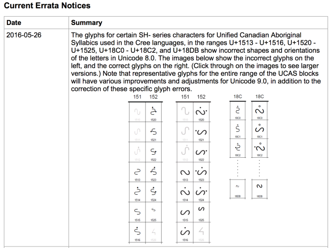 A screenshot of one of the Unicode errata notices related to display of characters in Cree languages. Image: via Kevin Brousseau’s blog.
On Point (Size): Limited Acknowledgements and Micro-Inclusions
Ultimately, the value of the Canada 150 font’s inclusivity seems to lie less in its utility than in its acknowledgment, however cursory, that Indigenous languages matter.
The applications of the font are limited by its being a display font, intended not for books or screens but for products like signs, t-shirts and mugs. On top of that, the typeface can only be downloaded by successful Canada 150 federal project applicants, so it’s not particularly accessible.
In the end, the Canada 150 font is probably more of a gesture than a tool. As Anishnaabe artist and activist Susan Blight reflects, “at best, what it might do is… [help] legitimize Indigenous languages as something that belongs and is part of the fabric of this land.”
Blight, describing language’s deep connection with culture, emphasizes that “there’s no way to support the resurgence of Indigenous communities, or the repatriation of Indigenous land and life in this country, without supporting the revitalization and maintaining of Indigenous languages.”
Blight has worked to make her own ancestral language visible in urban landscapes where it’s been erased. As part of her project Ogimaa Mikana, Blight sought to reclaim Toronto sites by covering street signs and plaques with replacements bearing the Anishinaabe language, Anishinaabemowin. She and her collaborator Hayden King later served as consultants for the Dupont Business Improvement Area’s initiative to include Anishinaabemowin place names on official city street signs. When those official signs were unveiled, Blight couldn’t help but notice how much more attention they garnered than her grassroots efforts had.
The uptick of interest elicited mixed feelings for Blight: on the one hand, she was happy to realize that people “want to see these languages included in official signage, in official things like the Canada 150 font.”
At the same time, Blight wishes folks wouldn’t wait for official decree to acknowledge Indigenous languages, which we should “be supporting across the board, not just when it’s done within permission of the state.”
As activists choose to work further and further away from state recognition, many people (some of whom, Blight noted, are hypervigilant about not appropriating the cultures of others) still “feel as though official recognition of something validates and legitimizes [it]. It’s a kind of belief in the system.”
“The system,” of course, is behind the suppression of Indigenous languages and identities. The dwindling of Anishinaabemowin, and many other Indigenous languages besides, “had everything to do with residential schools,” which enforced cultural assimilation both brutally and officially, Blight notes.
And restitutions promised by the government—again, officially—have yet to manifest. So while Blight appreciates official gestures of inclusion, she considers them in their relevant context: one in which our current “government still has not committed to any kind of action around revitalizing Indigenous languages.”
Metis artist Christi Belcourt has criticized this governmental apathy, in turn, with direct reference to the Canada 150 celebrations. Via tweet, she implored: “Let this sink in: Canada found $210 million to celebrate its 150th birthday. But only $5M for Indigenous languages.”
As symbolic and, indeed, as buried as it is, the Canada 150 font will be quite limited in its impact. It’s a micro-inclusion that raises some awareness and, one hopes, indicates a shift in popular attitudes.
Awareness and hope, though, don’t lead directly to action. And so perhaps what’s most valuable about this font is the story it tells about what progress, even “officially” backed, often is: grassroots, and glitchy; not sufficient, but necessary.
Heather White is a writer and a therapist in Toronto.