1. Rijksmuseum reopening, Amsterdam
It was with a blast of fireworks and fanfare that Amsterdam’s Rijksmuseum reopened in April. Rightly so considering that the national museum of art and history—beloved by the Dutch and housing one of the world’s most important collections of masterwork paintings, drawings, photographs and artifacts from the Middle Ages to modern times—had been shuttered for the most part and under full-scale renovations for the past decade. Repeatedly delayed from an initial four-year reconstruction timeline, and with overall costs coming in at the tidy sum of 375 million euros (roughly $547 million Canadian), there was a palpable sense of anxiety, anticipation, and not a little bit of pride hovering amid the opening-week hoopla. What the Dutch (and the rest of us) got for that patient investment is a feat of 21st-century museum design.
Spanish architecture firm Cruz y Ortiz have refashioned the Rijksmuseum, whose prior building by Dutch architect Pierre Cuypers opened in 1885, literally from the foundations up, reclaiming the museum’s two soaring courtyard atriums (formerly filled by a tiered warren of galleries) as a central pivot point. New light-filled galleries—including the Cruz y Ortiz–designed Asian Pavilion—have been opened up and expanded, nearly doubling the overall exhibition space. Many of Cuypers’s original decorative flourishes that had been previously neglected or destroyed have also been restored, notably the sequences of ornamental grand-history paintings on the walls and ceilings of its main hall–like galleries (during the press tour, a museum guide likened them to nationalistic propaganda) and on the museum facade. In June, an “outdoor gallery” sited in the gardens surrounding the building debuted, offering a mixed-use public space filled with classical statues and fountains, a 19th-century greenhouse of rare heirloom plants, and a children’s playground with equipment by pioneering Dutch architect Aldo van Eyck.
Yet for all of this architectural innovation and recuperation (which garnered Cruz y Ortiz the inaugural 50,000 euro Abe Bonnema Architecture Prize in October), what remains remarkable about the new Rijksmuseum is its primary focus on the collection. For its reinstallation, the Rijksmuseum’s curators have taken a less-is-more approach to the museum’s holdings of roughly one million objects. Eighty galleries are filled with a comprehensive survey of 8,000 artworks and objects in what amounts to a narrative trajectory that is at once sophisticated and manageable. Wandering through the galleries, a dynamic synergy sparks between items on display, framing them not only in the context of a specific time and place (the galleries are organized along a historical continuum) but also in a kind of reciprocal dialogue from object to object and room to room. All of the works on view were fully restored during the museum’s 10-year closure, and with the addition of custom-built display vitrines of non-reflective glass, there is a kind of hyperreal contact that happens between object, history and the immediacy of one’s presence in the gallery.
Of course, all paths at the Rijksmuseum eventually lead to Rembrandt van Rijn’s masterpiece The Company of Captain Frans Banning Cocq (1642), better known as The Night Watch. Considered by many to mark the summit of Dutch Golden Age painting, it presides over the museum’s cathedral-like Gallery of Honour—which itself offers an amazing journey through side galleries of further iconic works by Johannes Vermeer, Jan Steen, Jacob van Ruisdael, Frans Hals and Rembrandt.
Seeing The Night Watch—and the rest of the new Rijksmuseum for that matter—is an experience not easily forgotten, but all things considered, it isn’t the part of my visit that has resonated with me most.
In the museum’s original design, Cuypers built a street-level underpass through the centre of the building to maintain the link between the heart of the city on one side and what were then developing suburbs on the other. Initially meant for a tramline that never materialized and then open to car traffic until 1931, the underpass has since served as vital concourse for bicyclists and pedestrians.
What would happen to this thoroughfare became perhaps the key issue of contention during the Rijksmuseum renovations. The museum and its architects saw the rebuild as an opportunity to claim the underpass as new museum space, while the city’s cyclist union lobbied to keep it open. In the end, the cyclists won out and as of May 13 bicycle traffic again flowed through the museum. When I was in Amsterdam, the passageway was closed for the Rijksmuseum’s opening-week events. It was clear though that, to their credit, Cruz y Ortiz found an elegant compromise, siting the museum’s main entrance way halfway along the underpass and, more impressively, lining the path with glass walls that look on to the museum’s atrium. The everyday traffic of the path weaves through the new museum, once more raising the bar set by the Rijksmuseum for institutional accessibility, openness and engagement. Maybe think of it as an active puncture that lets some of the rarified air out of the usual big-museum bluster and attitude. If there’s a better way to integrate an experience of high-cultural and public space, I’d like to know it.
2. “Laurent Grasso: Uraniborg” at the Musée d’art contemporain de Montréal
I knew right away that Laurent Grasso’s exhibition “Uraniborg” would be among my top picks for this year when I saw it (twice) this spring at the Musée d’art contemporain de Montréal. I had come across the Paris-based artist’s work once before in Montreal; his digitally composed video projection HAARP (2007) was a highlight of the 2010 group show “Magnetic Norths” at Concordia’s Leonard and Bina Ellen Art Gallery. But what Grasso did at the MACM was nothing less than extraordinary.
Co-produced by the MACM and the Jeu de Paume in Paris (and, it should be noted, co-curator Marie Fraser’s last show before departing the MACM in May), for me, “Uraniborg” was more of a perspective-bending journey into the imagination than an exhibition. It was easy to lose your bearings in the dark, labyrinthine layout where galleries of large-scale video projections (for the most part) were linked by a rambling warren of long hallways. As you moved between galleries, cutout windows interspersed along these dimly lit passages presented tightly framed views onto reliquary-like installations of aged manuscripts, sculptural relics and antique paintings (either borrowed from museum and library collections or replicated by Grasso) or monumental neon text works. Some hallways ended at a single spotlit history painting, while others opened onto arrays of Bosch-like canvases depicting apocalyptic reactions to the solar eclipse or vintage photos of the papal observatory. The subjects of Grasso’s videos offered equally fascinating discoveries: a pensive study of desolate military surveillance outposts along the Spanish coastline; the drone-like flight of a hawk outfitted with a spy camera; the chimerical forms and mysterious legacy of a once-lost sculpture/pleasure garden; the pulsing mass of a flock of starlings at twilight above the Vatican; and the paradoxical history of Uraniborg, the Danish island that for a short time in the late 16th century was home to an astronomical observatory complex built by Tycho Brahe.
“Visibility is a trap,” Grasso warns in one of his neon text works in the show, and you never quite knew what you might run into around the next, dark corner. But there were subtle breadcrumb cues in the exhibition’s staging to lead a viewer along, and in the end everything was in some way connected. There was a kind of menagerie effect to it all. By slowly revealing what at first would seem to be oblique parallels between eras, objects and images, Grasso threw all perspective into doubt. Lost in “Uraniborg,” you had the overwhelming sense that you were no longer grounded in the real world, but transported to floating meta-realm where fact and fiction, time and place, reality and mysticism revolved in constant collision. Call it an intellectual high if you like, but emerging from the gallery, I didn’t feel quite the same—which is, in the end, what made it so great.
3. “Thomas Demand: Animations” at the DHC/ART Foundation, Montreal
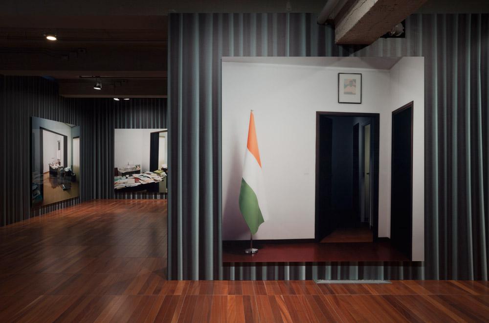
The other exhibition that I immediately pegged for year-end coverage was “Thomas Demand: Animations” at DHC/ART in Montreal. But it wasn’t just the strength of curator John Zeppetelli’s exhibition—which surveyed the German artist’s meticulously composed photo constructions and stop-animation film works—that made this exhibition for me. Instead, what really stuck with me about the Demand show was an unexpected conversation I had with a gallery security guard. While working my way around the otherwise empty fourth-floor gallery where Demand’s Embassy (2007) photo series was installed, I noticed the security guard carefully watching my reactions and taking notes. There’s nothing so odd about that, I figured; people-watching must help fill in the hours of what I suspect is often a pretty boring job. When he eventually approached me, though, I realized that it wasn’t scrutiny or boredom, but curiosity that was behind his attention. He wanted to talk about the work, and we spent the next 45 minutes in what proved to be a thoughtful and engaged conversation about Demand’s practice and the DHC/ART installation.
He had researched Demand online and knew all the intricacies behind the Embassy series—the weapons of mass destruction evidence that emerged on Niger Embassy letterhead, and the fact that Demand had cased the building under false pretences in order to memorize the specifics of office interiors seen in the photos. We talked about the constructed, then fleeting, reality behind Demand’s process of building meticulously detailed full-size models of his subjects, then photographing and destroying them. We debated at length the intentional disruption of fact and fiction or memory and truth underscored by subtle differences in the placement of an ashtray, a coffee cup and a cigarette package in three photos of an embassy-office desk. He suggested the false security of Demand’s photos of closed or slightly ajar embassy-office doors, considering that they were, after all, made of paper. He pointed out the blank portrait frames subtly hung on the embassy walls; I described a similar observation in an exhibition I had once seen in London of Demand’s photos of a reconstructed Oval Office. And he shook his head at the artistic/curatorial conceit of papering the gallery walls floor-to-ceiling with the image of a drawn curtain. Not that he didn’t like the metaphorical gesture—he did—he just thought it was a lot of work invested in something that would be torn down and thrown away when the exhibition ended.
In the end, we introduced ourselves, then returned to what we’d been doing before the conversation was struck. I never told him that I worked at an art magazine. That didn’t really matter anyhow. What was important to me was to have had that conversation outside of the rote professional niceties of the usual artist-curator-critic dynamic. It reminded me of the common human element in all of this, of the power of art to engage and excite no matter what part of the art world you come from, and of the value in taking the time to talk and think about an exhibition—especially, it seems, with a stranger.
Bryne McLaughlin is the managing editor of Canadian Art.

