Two distinct interpretations of light vie for attention at the Vancouver Art Gallery. On the ground floor, “Claude Monet’s Secret Garden” treats light as ephemeral and amorous, while on the second floor, Los Angeles–based artist Elad Lassry is interested in light’s mischievous, manipulative and precise properties.
Lassry’s first major Canadian exhibition showcases a decidedly popular aesthetic: the walls are lined with colours and poses more widely seen in marketing, advertising and documentary image-making than in fine art—but they are masterfully imbued with visual tension. The works invite viewers into a space of subtle discomfort. Using form to direct attention to content, they seem to suggest that a reappraisal is due of popular visual codes that are not often interrogated.
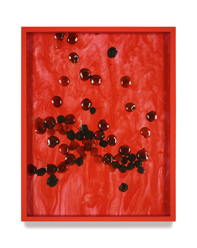 Elad Lassry, Cherries, Raspberries, Blackberries (Marbled), 2010. Chromogenic print with painted frame. The Baltimore Museum of Art: Roger M. Dalsheimer Photograph Acquisitions Endowment, BMA 2011.67.
In his essay “Rhetoric of the Image” (1977), Roland Barthes discusses the notion of “Italianicity.” The French theorist analyzes an advertisement for Panzani, a brand of pasta, and considers why we can’t help but associate the pictured net bag and the groceries inside with fresh-from-the-market, homemade meals—and go on to transfer this “authentic” association to the plastic-wrapped and canned Panzani pasta and sauce. Much about this ad, and this inclination, doesn’t make sense.
And at its core, Lassry’s work questions this tendency. It interrogates the associations we make and instinctive expectations we have when approaching an image, particularly in advertising—a coalescence of the linguistic, symbolic and literal to create an air of meaning.
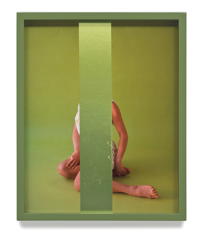 Elad Lassry, Untitled (Green), 2014. Foil on chromogenic print, painted frame. Rosenblum Collection. Photo: Courtesy of 303 Gallery, New York.
Lassry’s foray into the depths and critique of commercial imagery and advertising aesthetic is effective because his adaptation is unsettling. Like the Panzani ad, the images Lassry produces (always the size of a standard magazine page, 11.5-by-14.5 inches, because this size fit neatly in his backpack as a student) seem agreeable and harmless at first—but upon a second glance, they’re brimming with absurdity.
Where advertising is meant to feel so inconspicuous it’s almost undetectable, Lassry uses censorship, sculpture and the photographic equivalent of uncomfortably prolonged eye contact (sometimes literally) to invite the viewer to more closely consider exactly what they’re seeing. This often takes the form of cacophonous (or sickly monotonous) colour schemes, or objects that seem functional but look very uncomfortable, such as Selkirk Rex, LaPerm (2011) and Untitled (Green Chair) (2011). Something is off—but what? Let’s take a closer look.
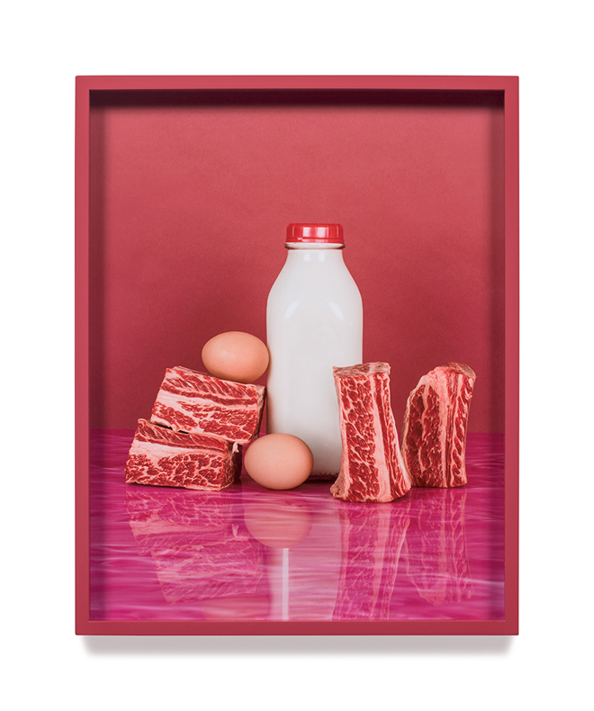 Elad Lassry, Short Ribs, Eggs, 2012. Chromogenic print, painted frame. Private Collection, New York. Photo: Courtesy of 303 Gallery, New York.
Lassry’s still lifes and portraits are careful and eerie. The still lifes feature foods, carefully arranged, and the precise composition of each image and its frame reflect the artist’s contemporary photoconceptualist inclinations. In Short Ribs, Eggs (2012), my nose crinkles with disgust at the sight of raw, marbled meat, standing on its edge; the sweaty, fleshy surface in direct contact with a matching red countertop. The colours of the white milk and the brown eggs, acting as the midground of the colourscape, give the image little contrast. In tandem with Lassry’s deep depth of field, this creates a feeling of flatness and compression, as if the air in the room is thick and hot.
Lassry’s portraits behave similarly. In Russian Blue (2012) and Devon Rex (2011)—really, in most of Lassry’s portraits—the subject looks disturbed, wrong. The lens Lassry used to shoot the portraits makes the tail on Russian Blue seem twice as long as the animal. Devon Rex is ruffled and angry-looking—quite the opposite of what one might expect from such a glossy presentation.
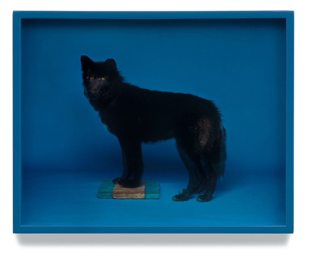 Elad Lassry, Wolf (Blue), 2008. Chromogenic print, painted frame. Courtesy of the artist.
In Lassry’s “sampling” of commercial portraits, from the pages of Life or Time, the original image is often altered in such a way that removes important context: a one-third-body-length portrait is cropped to show only the subject’s face, removing our ability to locate him in space. This insinuation and obscuring of information elucidates how misleading photography is, and how we are inclined (foolishly, perhaps) to trust it.
Just as John Baldessari has created works through selective censorship, Lassry has used sculpture or other media to eliminate or obscure information. Untitled (Green) (2014) is a portrait of a woman in a swimsuit, characterized by its ad-like qualities. The tension of the image comes not from the subject engaging the camera with eye contact, but from the strip of silk ribbon that Lassry uses to cover the face and torso of the subject—two areas that the viewer looks to first to establish a relationship with the image and its subject.
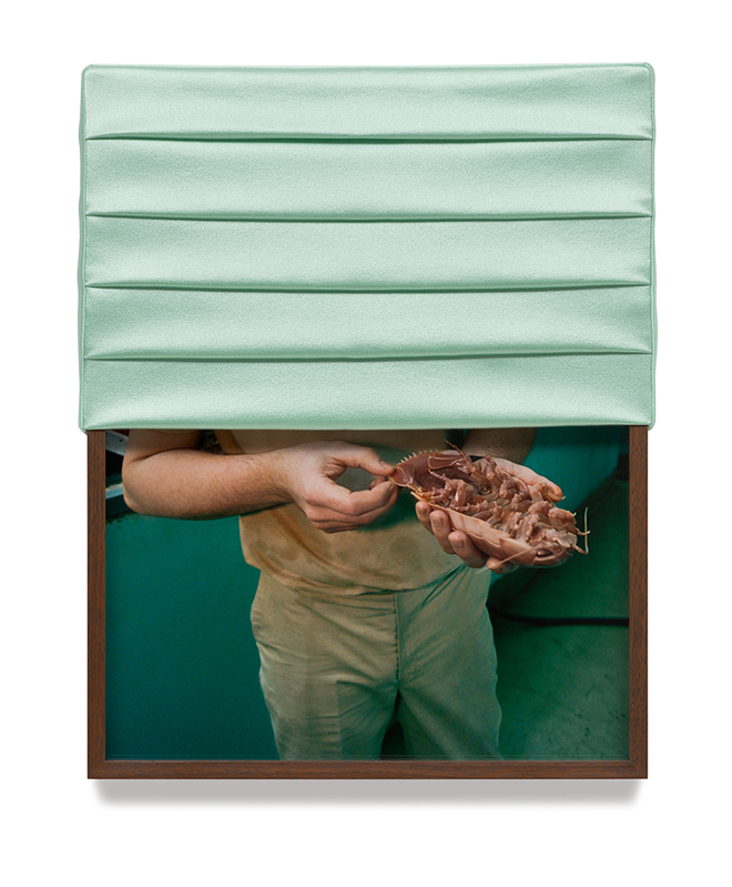 Elad Lassry, Untitled (Isopod), 2013. Chromogenic print, walnut frame, silk. Private Collection, Houston. Photo: Courtesy Galerie Francesca Pia, Zurich.
Lassry’s work often teases the viewer by partially obscuring the information we crave the most, that which is our clearest path to understanding an image. With that strip of silk, and other forms of sculpture—like the blind covering Untitled (Isopod) (2013)—Lassry removes the possibility that what we’re seeing is actually an ad. Instead, he locates it firmly both within the gallery space as an object or sculpture and outside of the realm of comprehensible image. The works teeter in the liminal space between image and object, protruding into the spaces we occupy while looking.
At this point, the importance of understanding the image falls away in favour of regarding and sharing space with the object. In Untitled (Inflatable Canoe) (2014), Lassry has blown out part of the image to eliminate the detail in a photograph of a canoe. The shape is distinct, it still appears to be a canoe—but the viewer can’t access the texture or detail of the image due to Lassry’s censorship. Lassry has attached a panel of enamelled copper to the bottom of the frame, as though, frustratingly, to offer information that we didn’t ask for while denying information we need.
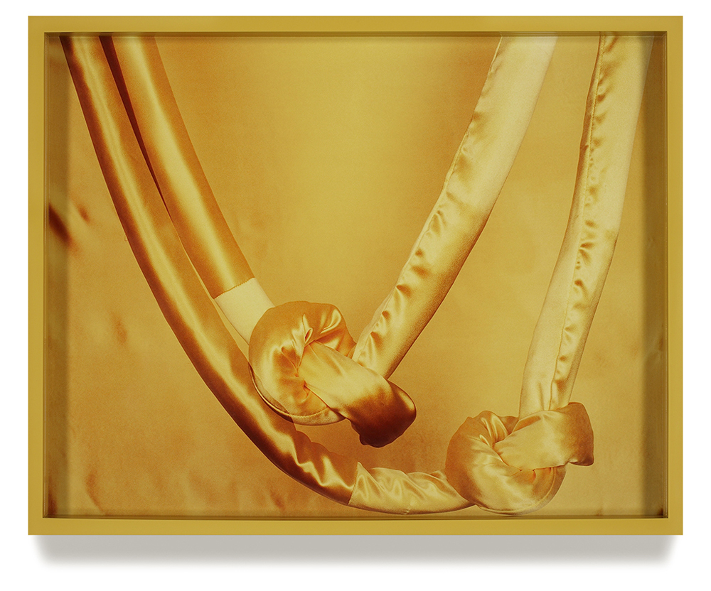 Elad Lassry, Silk Rope, 2010. Chromogenic print with painted frame. Collection of Suzanne Deal Booth. Photo: Courtesy of 303 Gallery, New York.
Juxtaposed against Monet’s “Secret Garden” and the VAG’s nostalgic and largely uneventful “Pictures From Here,” Lassry’s work is vulgar and sexy, providing an updated narrative to the VAG’s own ages-old assertions about photoconceptualism. Co-curated by gallery director Kathleen Bartels and Vancouver forever-headliner Jeff Wall (whose work is prized in “Pictures From Here”), Lassry’s oeuvre explores the natural progression of photoconceptualism as it presses further formally—as it extends into physical space, shrinks to the size of a magazine spread and returns to primarily studio production. This narrative is refreshing: I was frustrated by how boring and derivative “Pictures From Here” felt, and the Lassry exhibition is a much-needed jolt to the heart of the VAG’s contemporary programming.
The show doesn’t add anything to the broader discussion of these aesthetics and their meanings and associations in terms of how they function in advertising, but it’s a feast for the eyes, engaging and accessible to the broader public. It’s the art exhibition equivalent of a popcorn flick, and makes for a great summer show.
Megan Jenkins is an arts writer, student, and web editor at SAD Magazine in Vancouver, BC. Her studies are anchored in advocating for greater accessibility, inclusion, and diversity in the arts.
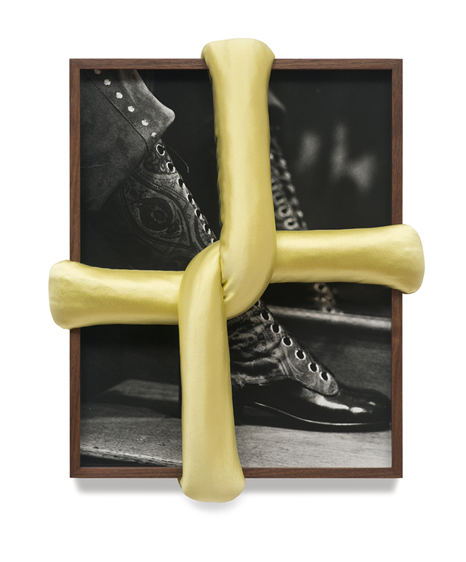 Elad Lassry, Untitled (Boot A), 2013. Silver gelatin print, walnut frame, 4-ply silk. Collection of Erin and Paul Pariser, New York.

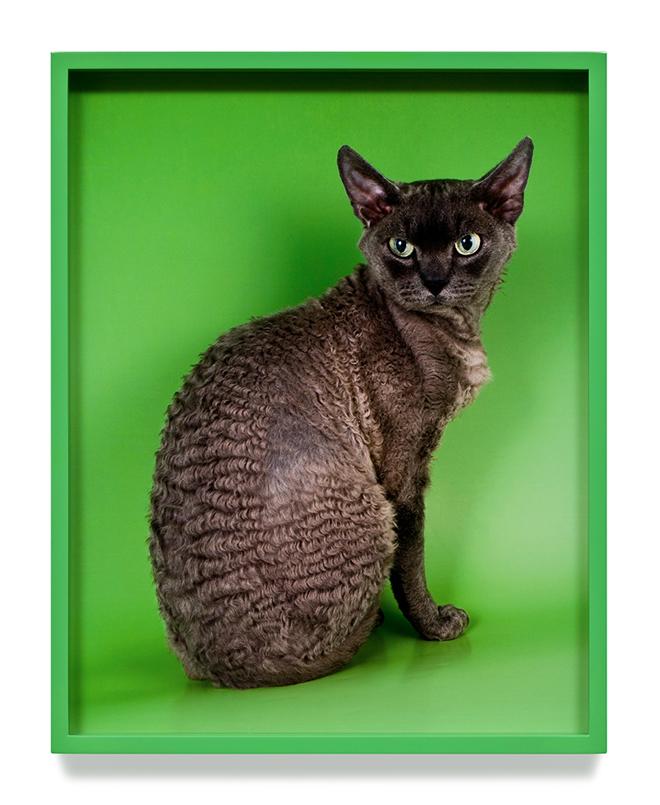 Elad Lassry, Devon Rex, 2011. Chromogenic print, painted frame. Courtesy of the artist. Photo: Courtesy of 303 Gallery, New York.
