There are a lot of things one can talk about with Montreal-based artist Vikky Alexander. One of these things is just how much she has going on right now and in recent months.
Currently, Alexander has a solo show—her first in the UK—on at Canada House in London, titled “The Spoils of the Park.” Also on now is “Other Fantasies,” a solo at her longtime gallerist Trépanier Baer in Calgary. In March, her prints were on view at Cooper Cole in Toronto under the theme “Between Dreaming and Living,” and her art was also featured at the Armory Show in New York. In December, her site-specific installation show “Unnatural Horizon” also opened at l’Escalier in Montreal.
Amid all this, there are preparations for a major career milestone: Alexander has an upcoming solo exhibition that surveys her 30-plus-year career scheduled for 2020 at the Vancouver Art Gallery, curated by Daina Augaitis.
Born in 1959 in Victoria, raised in Ottawa, educated in Halifax and having worked for long stretches of time in New York and Vancouver, Vikky Alexander bridges many places and multiple art movements—not to mention generations. In recent years, her 1980s conceptual photoworks have found favour among twenty-and thirtysomethings, while as an artist she continues to keep evolving, riffing on, remaking and reading deeply into what drives image-making today.
In this condensed phone interview, Alexander reflects on what ties her early work—even some of her NSCAD student work—to her current practice, and also on what it means to “belong” to different art movements and centres.
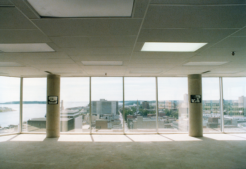 The 1978 installation Vikky Alexander installation Viewing Space in Halifax. Created while Alexander was a NSCAD student, the work foreshadows some of her later approaches. Photo credit: Gerhard Richter.
You studied at NSCAD in the 1970s. What did you study there, and how did it lead you (or not) towards the image-appropriation practices you became known for?
I studied there between 1976 and 1979. And I took, like everybody, a variety of studio courses. But I have to say one of my favourites was darkroom photography. I just loved the medium; it was like magic.
I also really loved the visiting lecturers—particularly Dan Graham, Dara Birnbaum and Martha Rosler. I would say Graham’s photography of architecture and the vernacular stayed with me, and analysis of feminism and pop culture through videos such as Technology/Transformation: Wonder Woman, and Rosler’s photo collage works like Bringing the War Home. These were all seminal pieces for me at that time, and I still go back to them.
The NSCAD darkroom, at that time, was a primarily male-dominated area. Not that I felt unsafe there—but the interest was primarily in street photography, and that seemed like a bit of a guy zone.
I loved the medium, but my approach was more conceptually based. I appreciated Birnbaum’s appropriative video pieces and Rosler’s appropriative collages.
One of the last pieces I made as a student was an installation called Viewing Space. Halifax was a small town at that point, and a bank decided to put in a glass tower, which seemed humungous at the time. Before it was completely rented, I did a piece on the 18th floor of that tower.
It was floor-to-ceiling glass curtain walls—mirrored on the outside, but with a panoramic view of the city from the inside. They had not put in any walls to make rooms yet, and all there was were these 11 concrete columns in the space. What can I say? No one gave me permission. I just said, well, I think I have an idea for something in here.
So for Viewing Space, on each concrete column I put a 16-by-20 black and white print I took from ABC captioned news for the hearing impaired—in these images, you don’t who they represent or where they are from, and there is this enigmatic text on the bottom of them.
I placed those prints at eye level and in a position what was clearly visible when you got out of the elevator, so it looked like surreal television in each concrete column. I put them up half an hour after the bank on the ground floor opened and took them down half an hour after it closed, as I was using the space without permission
I was interested in the contrast between the panoramic view and the mediated, broadcast view. That was my first piece using appropriated imagery.
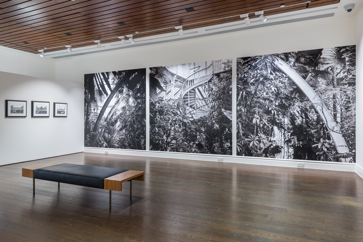 A view of “Vikky Alexander: Spoils of the Park” at Canada House in London. Photo: Courtesy Canada House.
That’s so interesting. Your current UK show also features this broad panorama of a kind of landscape, opposite a series of quite smaller, almost diorama- or TV-like scenes, too. I want to talk about that more a moment, but for now I want to keep following the chronology: When did you first start investigating and photographing images in fashion magazines? Why did these images compel you and why did you want to work with them?
I moved to New York in 1979 directly from Halifax.
As I said, I had been photographing broadcast TV in the last year of art school and also backlit billboards, trying to figure out if I could work with those.
So I think moving on to magazines was a logical progression again—I didn’t want to take photographs on the street; as was trying to make works about media representation.
How did you shoot the magazine spreads, in a logistical sense?
It was a fairly simple process to set up. I just had a 35 mm camera with some cheap close-up lenses, a cable release, and a second-hand copy stand. So it didn’t take up much space. And then all you needed were the magazines.
I had a friend who ran a bookstore in Soho and he used to lend me the magazines, like, the really expensive ones. I would shoot them and give them back to him—in those days I had no money, and Italian Vogue and French Vogue were quite expensive.
This was a sneaky way of doing it. The European mags were the most expensive, but they had the best quality images to work with. And there was less text around them; text was not something that I wanted.
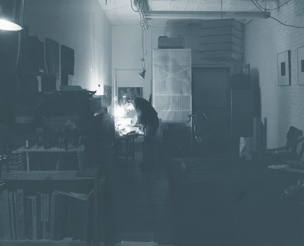 Vikky Alexander working at her copy camera stand in her old New York City studio in 1980. Photo: James Welling.
What drew you to those particular magazines beyond the image quality? Did you enjoy reading them growing up?
I think as a young woman, I was always fascinated by the staging of these editorial fashion spreads. And then, by isolating the models, by using extreme cropping and eliminating the text that is around them, and using things like repetition and juxtaposition, you could highlight the dramatic sensuality of these images.
Certain methods—like repetition and juxtaposition—work to emphasize the artificiality of the situation, as does the degree of enlargement, which is something that is hard to describe to people who are used to digital, because I always wanted the viewer to know I wasn’t photographing models. I wanted them to identify the source as being a print image.
When you photograph part of a magazine page, and you blow up the images up to at least 20 by 24 or 24 by 36, then you have an identifiable grain to the image, and you are saying [to the viewer] this is sourced from something else.
How did you print the photos? Did you have a darkroom? Or another process?
I would just save up and get them printed at a lab. I didn’t make that many pieces in those days. And they were big pieces for the early 80s. I maybe made two or three pieces a year—and if they were an edition, I certainly didn’t print out the edition.
The works were all colour until 1983. I did do a [1980s black and white] piece called Obsession that Cooper Cole put in his Miami booth last year—10 black and white photos of Christie Brinkley with a yellow plexi overlay. Those I printed in my loft in New York. I enlarged them on the wall and then I developed them on plastic sheets on the floor. It was crazy. Simon [Cole] has digital versions of the same images, but as for the original ones, that’s how I made them.
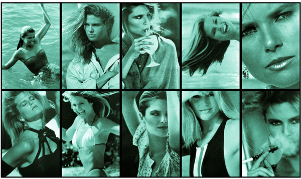 Vikky Alexander’s Aqua Obsession (1983–2016) was part of Toronto dealer Cooper Cole’s presentation at NADA Miami in 2016.
You are identified by some critics as being of the Pictures Generation, and by others as being connected to the Vancouver School of photoconceptualism. How useful are these categories, do you think? How do you respond to them in your own mind?
Well, I did live in New York from 1979 to 1992, so it was a pretty large part of my life. But until recently, that whole part was overlooked in Canada—and I almost kind of forgot about it myself, because your work just keeps going.
I can see that a lot of the work doesn’t look dissimilar [from those movements] but I didn’t think about it for a while. Now I think it’s good to have a historical context for the pieces, because there are some weird similarities.
Now that I am looking back at stuff, I think it’s important to recognize the artists I was showing with at the time: James Welling and Annette Lemieux and Allan McCollum, for example, we were all showing at East Village gallery Cash/Newhouse in that era. And I was also included in with a group of photographers using appropriation, like Jennifer Bolande, Sarah Charlesworth, Barbara Kruger, Phillip Lamb, Frank Majore, Richard Prince and Richard Ross—so you know, all that is legitimate.
Part of the identification is that that people are looking at the Pictures Generation again, which has become a broader group. And it’s not dissimilar from the Vancouver School [trajectory], which has become a broader group than when it originally started.
My first exhibition in Vancouver was in 1983 at the Coburg Gallery. And that was with Obsession—the Christie Brinkley piece. At that point, I had already met Jeff Wall and Ian Wallace and Rodney Graham through Dan Graham, and we would socialize when they were in New York or I was in Vancouver.
I certainly identify with these artists’ conceptual methods—despite my gender, some might say—and I like to think that the Vancouver School of photoconceptualism has become a larger group than it was originally. I lived in Vancouver from 1992 to 2015, so I do think it makes sense to be identified with the city and its photographic history.
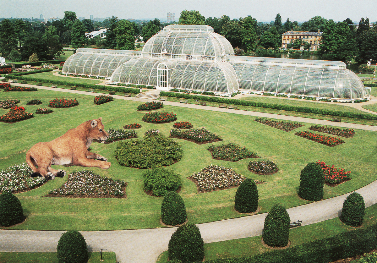 Vikky Alexander, Lioness at Kew Gardens, 2013.
Your first UK solo show is on now, and juxtaposes a black-and-white greenhouse panorama on one wall with smaller colour images of animals in luxury settings on other walls. Why did you want to focus on that work for this first UK solo show?
I’ll start with the colour pieces. I have a collection of postcards I pick up when I travel, and I was thinking, “How can I use them? I can’t stand to send them, they’re too nice.” And I came up with the idea of putting animals in these stately homes.
I had these catalogues of little plastic animals around because I was using those for another piece. So I cut out these little tiny animals and glued them on the postcards and scanned them. That was in around 2013.
I tried to pick quite exotic animals for these works—no sheep, no cows, no horses. Rather: giraffes and gazelles and cheetahs.
I thought these would be kind of funny to show this work at Canada House because first of all, it’s right across from the National Gallery on Trafalgar Square, which has quite an established, stately feel. And then Canada House has its established, stately feel to it too. The building features lavish reception rooms themed after different provinces in this period architecture, it seemed like an appropriate setting for collages that feature animals running wild in stately homes and gardens. It seemed like these animals would be the perfect thing to put in there.
There are also some small drawings in the show—drawings of exotic animals in an 18th century French garden folly outside of Paris called Desert du Retz. Initially, I was doing drawings of this garden by tracing some etchings of follies that were in this park, and I realized the drawings needed something else, like the architecture wasn’t enough for me. The easiest way to push it was to draw these little plastic animal figures in there. So the drawings are akin to the postcard pieces—these little animals are in a place they really shouldn’t be.
The final piece in the Canada House show is the large triptych of black and white images that I took at Kew Gardens outside of London. I took them in the palm house, in a steel and glass structure—one of the few remaining at the gardens.
In the palm house, there are all these exotic plants. When I went there, I thought I would be photographing the architecture. But when I looked at the photos, it was the plants that were taking over the architecture. I did it in black and white because the colour was too pretty, and black and white was more like 1950s-threatening, Day of the Triffids.
While the photo collages and drawings at Canada House portray fauna running wild but dwarfed by architecture, these black and white photos show flora outgrowing their confining structures—branches colliding with glass, basically straining to challenge the architecture. I thought of the plants as a metaphor for the colonies, initially stolen and now becoming as strong as their “mother country.”
That triptych is something that I initially put together for Nuit Blanche in Toronto in 2012. They were placed in the atrium of the Eaton Centre at a scale of about 30 by 30 feet. Christina Ritchie curated that show, and we liked the juxtaposition of the 18th-century palm house building with the contemporary glass structure of the Eaton Centre. When I redid it for Canada House, I scaled it down.
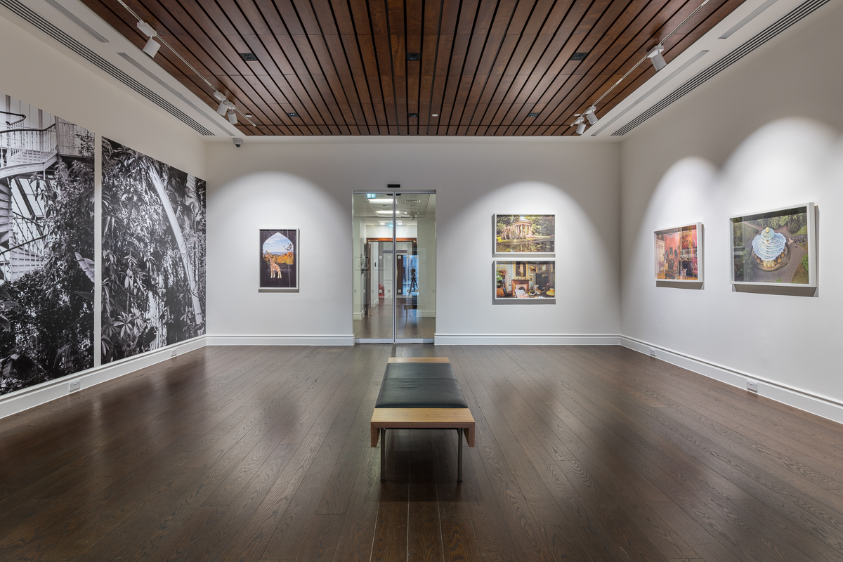 A view of “Vikky Alexander: Spoils of the Park” at Canada House in London. Photo: Courtesy Canada House.
It’s funny, putting those Kew Garden images in the Eaton Centre would almost seem to be in conversation with Michael Snow’s Canada Geese in the centre’s south entrance. But you also have large wall pieces in your current show at Trépanier Baer in Calgary. Can you tell me more about those?
I did a public project for the Contemporary Art Gallery in Vancouver last year, on the glass-fronted Yaletown-Roundhouse Skytrain Station. It used a photograph from my series Model Suite—a 2005 project focusing on views of Vancouver as pictured in the fake windows of condominium model suites.
That made me start thinking about larger scales and vinyl, and I did another exterior piece, a mural.
Then, I recently did a piece in Montreal which was using another image from Model Suite—I did a wall-scale photo of model bedroom inside L’Escalier. L’Escalier is an exhibition space in the home of a writer; I thought, “Oh, this is a domestic space. And I will put this salesroom domestic space within his actual domestic space.”
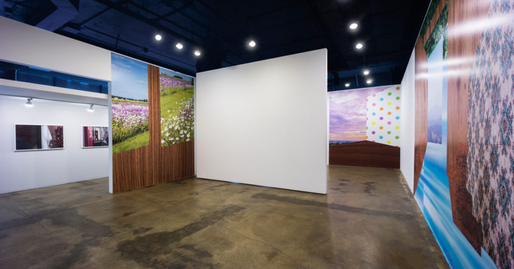
Thinking of what to do at Trépanier Baer, I thought, I want to take these small paper collages of interiors, with origami paper and shelving paper and found images—I’ve been doing them since 2001—and make them bigger.
I was already having these collages, in recent years, scanned and printed on canvas, so that they became kind of like paintings. And I had always wanted to do them bigger, but until recently, I couldn’t figure out how, because a canvas printer will only go to 60 inches wide.
And then I thought, well, I can do self-adhesive vinyl—I found a great printer for that in Northern Quebec—and put them into rooms in the gallery. So I’m showing five of those in Calgary, just placing them floor to ceiling, whether coming around corners or in the middle of a wall. I like the idea of the viewer being placed right inside the room itself.
This show, then, is turning my image work into an installation piece again.
In Calgary, I’m also showing some colour photos I took in Tokyo in the Ginza a couple of years ago. They are images of shop windows. I have also done shop windows before in Istanbul as well as in Paris. I’m interested in luxury objects that are behind glass and then the glass that reflects the passerby. I’m also interested in the display mechanisms that are used in the windows.
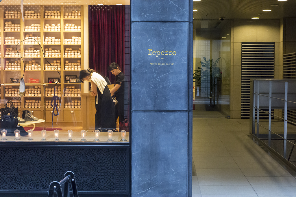 Vikky Alexander, Ginza Repetto, 2018. Archival inkjet print on Epson premium luster paper mounted on dibond. Edition 1/3 – 28” x 40”. Courtesy the artist and Trépanier Baer.
It’s so interesting to hear all this. The fashion work from the 80s could be read, by some, as a study of heavily constructed lifestyle fantasies—and likewise, these model-suite and collaged-interior and shop-window spaces also speak to a kind of constructed, commercially endorsed fantasy. It seems like a pattern in your work is always taking a closer look at that.
The larger pieces in Calgary and London are sometimes about nature and culture, the picture window, the natural coming inside and messing up architecture. And the photographs are a little more display-oriented—when I look at these shop-window images now, I see where they came from, and they definitely came from the 80s. I’m just appropriating in a different way, kind of.
And yes, the idealized spaces are definitely part of condo model work. The condo sales pitch implies that these model suites are attainable, but really they are not. That salesroom that I referenced for Model Suite was built on the ground floor—but all the views were fake and backlit. Even if you were really on the 30th floor, all the views the suite windows showed of Vancouver didn’t match up—they were completely disjointed.
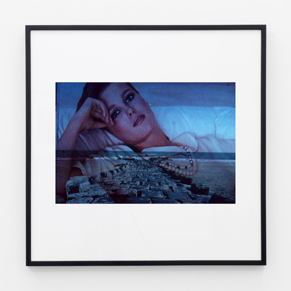 A 1985/2008 work from Vikky Alexander’s March 2018 exhibition “Between Dreaming and Living” at Cooper Cole in Toronto.
What do you think in regards to the resurgence of interest in your early work at contemporary art fairs like NADA Miami, the Armory Show and beyond?
It’s interesting for me to start to relook at older pieces. The Tokyo showroom images— well now, I completely see them relating to the work from the 80s. But that’s not what I thought when I was taking those images. So that part is interesting: in self-reflection, thinking, “Wow, not that much has changed.”
At the same time, it’s very hard to be completely self-aware of your place in history. I just get little bits and pieces. Sometimes I end up saying, “Really? Is that part of that?”
I don’t know. But you can only know what you know. Sometimes things hit a nerve, and sometimes they don’t.
This post was corrected on April 16, 2018. The original misstated Alexander’s birth year. It is 1959, not 1956. And it used the words “British Museum” where “National Gallery” was intended. We regret the error.

