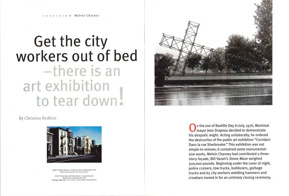
On the eve of Bastille Day in July, 1976, Montreal mayor Jean Drapeau decided to demonstrate his despotic might. Acting unilaterally, he ordered the destruction of the public art exhibition “Corridart: Dans la rue Sherbrooke.” This exhibition was not simple to remove; it contained some monumental-size works. Melvin Charney had contributed a three-story façade, Bill Vazan’s Stone Maze weighed 500,000 pounds. Beginning under the cover of night, police cruisers, tow trucks, bulldozers, garbage trucks and 65 city workers wielding hammers and crowbars moved in for an untimely closing ceremony.
“Corridart” was planned as the most important arts and culture event of the 1976 Olympics. Linking the city core to the Olympic site, it occupied 5.5 kilometres along Sherbrooke Street. To get the best out of a budget of $386,000 and create a critical mass, artist/architect Melvin Charney had come up with the idea of turning the street itself into an art happening. All along the route were sections of bright yellow scaffolding that held photographs showing the history of the street and its people. Large orange hands attached to the scaffolding pointed at galleries, architecture and other permanent Montreal landmarks. Inserted into this streetscape were 50 to 60 art installations and two stages that were scheduled to host over 700 performances. Like Sherbrooke Street itself, the exhibition was multifaceted—it was meant to bring art and the city to the attention of people who might otherwise not give them a second thought.
This past summer, the exhibition “Corridart: Revisited” opened at the Leonard & Bina Ellen Art Gallery of Concordia University in Montreal. It was a good excuse to talk with Melvin Charney, the curator and organizer of the original “Corridart,” as he remembered the events of 25 years ago amidst his preparations for a retrospective of his work at the Musée d’art contemporain de Montréal.
Christine Redfern: How would you define the work in “Corridart”? It is political, conceptual, historical, architectural
Melvin Charney: Yes, it is all of that. I remember at that time quoting Pierre Bourdieu. He said the main role of art is to allow the privileged to see themselves privileged in their own eyes. Which is quite true. As soon as someone has wealth, you confirm that by surrounding yourself with various objects that have a certain cachet. My starting point with “Corridart” was to show the people the city privileged in their own eyes.
Yet Drapeau said after seeing the exhibition, “I was shocked, I was humiliated, I was insulted.” The whole show was put up with the cooperation of the city of Montreal. City representatives were sitting on all the main committees. It was up for a week before it came down. What is interesting to me is when it came down. It came down right before the Olympics opened. So what one saw in the newspapers—you saw “Corridart” coming down and the Olympic flag going up. And Drapeau was back in the news, four months after having the Olympics taken away from him.
In the press that followed, a city employee blamed the demolition of the exhibition on unsafe scaffolding. The Montreal Olympics took place four years after the 1972 Olympics in Munich, where 11 athletes were shot to death. Everything went through the Security Committee; nothing went out in the streets prior to that. Drapeau just lied through his teeth. To me the situation is similar to when someone is raped and the judge looks at them to see what they are wearing, to see if they’re attractive, like it is somehow the fault of the victim.
In hindsight, do you see any reason for Drapeau’s censorship of “Corridart”? At that point one is speculating about the mentality of someone who had a very, very autocratic personality. He just didn’t believe in a democratic society, so that’s his problem.
I know he passed by-laws outlawing newspaper boxes and hot-dog vendors. Do you think the show went against his sense of aesthetics? Did he want interior decorating as opposed to art? I don’t know anything about his sense of aesthetics. He was a very political creature. Remember what he said during Expo ’67? He said what you do with slums in Montreal is you put art in front of them and the kind of art that no one understands. He was ironically savvy when it came to being an art critic. Maybe he thought that too many people understood the art in “Corridart,” maybe it was too accessible. None of that is relevant. The only thing I sensed was that he simply needed to get back in the front pages of the newspapers and saw one of the ways to do that, like all authoritarian and totalitarian politicians and leaders do: you knock heads, show your power symbolically.
He showed his power. I saw a picture of Jean-Pierre Séguin’s installation being loaded directly into a garbage truck. Other works were dismantled and impounded by the city. Is it true the pieces were not returned for 44 months? Today’s headline in the New York Times arts section says, “What is art in the street? Anything goes.” 25 years ago it wasn’t that evident. When we had the competition to get art for “Corridart,” most of the submissions that came in were not valid. What we were looking for was art that could be in the street and would not be permanent. We hoped that people would push the idea of art as experienced gesture and not as an object that’s for eternity. So the whole idea of getting art back I found a totally odd point of view. In “Corridart: Revisited,” the question I’m getting from a lot of people is how come none of the art is there? It was never conceived to be there other than during the exhibit. The houses that I did, I would have destroyed the work myself. The scaffolding was rented. The plywood was temporary. I actually had a deal with the builder to give us a lower price to fabricate it on the condition he would take the plywood back and re-use it.
In some cases there are objects that still exist though. Kevin McKenna claims he still has the photomontage Rues—miroirs, but the work has no meaning to me unless it is in the street. Because what the work did was reverse the perspective. The Western view of representation is based on perspective. The photographic works on the street showed that perspective in an urban grid is not possible; there are too many focal points. McKenna’s work picked up on that. When you put it into the street and it is a photograph of the street itself—there is a one-to-one relationship.
The symbiotic relationship of the artworks and the city was important to you? The best works in the exhibition were works that reflected the city. That took ordinary elements of the city and did something with them that made people aware of them. For example, Pierre Ayot’s piece I thought was absolutely a work of genius. He took the cross of Mont Royal, did a reproduction of it exactly the same size and laid it on its side on the McGill University campus. There was a gesture there of taking the cross down from the mountain. Another example is Cozic’s Cross-country. He made trees look like competitive runners. To have the numbers and colours that were wrapped around the trees shown in the gallery now is meaningless to me. That was the aspect I had to discuss a lot with Concordia, to explain to them that when you have a show that was successful out in the street, you cannot do a show of the same pieces in the gallery.
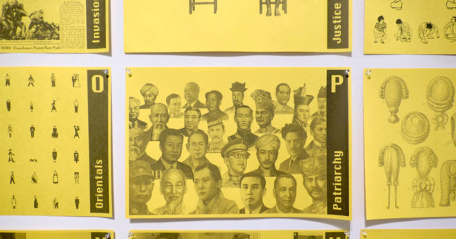
How did “Directions Montréal 1972–76: Véhicule art” fit into the exhibition? “Véhicule art” was created to include other important artists. Because artists such as Betty Goodwin and Charles Gagnon didn’t submit anything to the competition. So we thought, in a city you see posters. Easel art as a poster is OK. It would work. So thirty artists made posters that were put up all over the city.
And the kites? That was a submission. Jean-Claude Thibaudeau had a boutique that sold kites that he designed. He brought together Jacques Hurtubise, Guido Molinari and Claude Tousignant and made kites from their artwork.
There was also theatre and performance work? There were two stages, one at the corner of St-Urbain and Sherbrooke streets, the other located in the little dead-end section of rue St-Christophe. On St-Christophe we rented the balconies of the two houses next to the stage so we could do Romeo and Juliet. The programming was done in conjunction with the arts and culture program of the Olympics; a lot of it was for kids during the day.
There seemed to be a real effort made to make this an inclusive arts event. There was text that accompanied all the work. We tried to make the exhibition as transparent as possible. This also was the premise behind the big hands pointing
They remind me of the big Monty Python hand. The idea for the hand came from a sculpture in Rome of a hand pointing. Also from a painting in the National Gallery, of an Iroquois pointing out to Champlain where to find Montreal. The actual hand we used was Mickey Mouse’s.
So it was Mickey Mouse’s hand that raised the ire of local developer David Azrieli. He wrote to Drapeau saying, “We regret the finger pointing at our building, which many of our tenants and prospective customers take as offensive.” I read an article from 1976 by Montreal Star art critic Georges Bogardi describing the work and was surprised how inoffensive it was. “The offending exhibit consisted of photos of the [Van Horne] mansion before and during demolition and of a brief quote from Université de Montréal professor of architecture Laszlo Demeter noting that a valuable piece of Victoriana and a part of our history has been lost and wondering, ’Which of our values will disappear next?’ That was all.” Azrieli was really just a mindless developer with a very big ego, and a direct link to Drapeau’s office. That is normal in any city. What’s not normal is the way the mayor reacted. (Azrieli was not the only one to have contacted the mayor. Most distressing was that some of the Anglo institutions, the Montreal Museum of Fine Arts and McGill University, also pressured the mayor to have the exhibition, or at least that part of the exhibition adjacent to their establishments, removed. The Montreal Museum of Fine Arts objected to the presence of a “Corridart” hand pointed at the front doors to show where art can be found!)
Another work that was controversial was The Teletron by Michael Haslam. The Teletron played dozens of tape-recorded messages, a few of which police deemed obscene, such as the message, “Let’s masturbate like we did last summer ” It seems prophetic now when recorded messages are everywhere and you can call numbers 24 hours a day to listen to whatever dirty talk you want. The real controversy behind that piece had nothing to do with obscenities. The Teletron upset the committee organizing the games. The messages gave figures on how much the games cost, where the money was going, who was getting what.
And Ayot’s cross on its side, there were people who were upset about it. This surprises me too when one considers the revolution that had taken place in the culture in the 10 preceding years vis-à-vis Quebec and the Catholic church. But it had not sunk in.
I like how he defended his work in the ensuing court battle between the artists and the city of Montreal. [After a break in the proceedings, people returned to find a darkened room and a slide projected on a screen. Ayot turned the projector off and the image remained. It had been printed directly on the screen. “You see, your Honor,” said Ayot, “you can’t always trust what you see . It’s only a reflection of what you think. There are many ways to see the same thing. That’s the message I was trying to communicate with the cross. There are other ways to see it.”] The idea of doubling, of creating mirrors of what is there’s a lot of the work went along that line of thought. At the intersection of St-Urbain and Sherbrooke, I put in a mirror image of the houses on the other corner. Not a reconstruction, a mirror image. We live in a city that has such an integral culture about it that the idea of working off that allowed us to do some original things.
When I look at “Corridart” I see many issues that are being discussed now in contemporary art: getting artworks out of the gallery, installation, time-based work, photographic manipulations. Is this “Corridart”‘s legacy? It is a legacy from that period. It seems to me that important present-day movements are mining ideas generated in the art that took place in the ’60s and ’70s. When I look at the contemporary art scene, I find much of it the stuff of what was done before, but it is being worked through now, resolved and redefined in sometimes more pertinent ways.
How did the removal of “Corridart” affect your work? “Corridart” coming down affected my work, but it also related to my work. For example, I have collected images out of newspapers, always, always, since I was a kid. And by 1968–69 I figured out what that was about, so I began to collect images that are now known as Un Dictionnaire…When “Corridart” came down, the Houses of Sherbrooke Street made all the front pages, so it completed a cycle for me. I did a piece of work that ended up being an image that I could put into my dictionary. So I said, “Ah ha, something’s happened here.”
How important were the Houses of Sherbrooke Street to your artistic development? I found that with the Houses of Sherbrooke Street I was able to cross a kind of threshold in my work. These are things you cannot will into place, they just happen. There was so much to get done to get “Corridart” up, I had very little time to work on the Houses of Sherbrooke Street. It took me just three weeks from conception to execution. In moving quickly, I synthesized a lot of ideas I had, and they just fell into place one after another. So the techniques that evolved very quickly really influenced my work and I was able to use them after.
Such as? For example, in the Houses of Sherbrooke Street, I did what I now call my constructive photograph. I reprinted the image backwards, snipped out half of it and stuck the two ends together. Then I re-photographed that constructed photograph and that’s my piece. I always had this idea that most people don’t go look at famous buildings around the world, they look at them in photographs. So rather than bother building them and looking for clients and spending all my life doing that, what I’ve done is to find sites around the world and put my buildings in there by manipulating images. It is kind of a reverse process, but it is much closer to an art process. Most architects look at a site, draw it up, build something and take a picture of it. I take my photographs first and then build what I see in the photographs.
I find it interesting that you use photography, in some way, in all your work. For me looking is photographing. The upcoming show at the Musée d’art contemporain in Montreal will be centred on my photographic work: early photographs, constructed photographs, painted photographs and the use of photography in “public art.” When I photograph anything, I find one view just doesn’t work. So I build up all my images through a series of photographs taken around the subject. And it is not like David Hockney’s work. My first piece like that dates from 1964, but I didn’t figure out exactly how to construct those photographs in a much more direct way until the Houses of Sherbrooke Street.
Have you used constructed photographs in recent work? In a recent series I’m doing I’ve been looking at trees very carefully. European trees are kind of large-scale bonsai; but trees in North America are amazing because they are all straight. My trees are made to grow into themselves, they become taller and straighter. Each tree is a constructed photograph; I stretch the tree, slot in pieces that aren’t really there.
You also mentioned painted photographs. When I did the Houses of Sherbrooke Street, after I spliced the two ends of the photograph together, I had to show that one part was going to be built. What I did was paint over one of the photographs to show the plywood in place. So then I began to paint on photographs. It has been my work since then. A current example I like is a series that uses photographs of ads for bras. There used to be a notion of one size fits all. The idea I am working with is one fit sizes all. Now, it is easier to rearrange the human being to fit the products. This is especially true in buildings, because everything has been standardized, so we have to fit ourselves to these standard spaces.
Any last thoughts on “Corridart”? I wanted “Corridart” to be as real about the place as possible and world-class. People don’t understand that here. We really pulled off a world-class event.
A feature from the Winter 2001 issue of Canadian Art

