[TMD] Ron Terada had only recently turned 40 when, in 2009, he began his Jack paintings, white-lettering-on-black-ground transcriptions of the riches-to-rags story of Pictures Generation artist Jack Goldstein (1945–2003), as told in the oral history Jack Goldstein and the CalArts Mafia (2003). What began as a 16-panel work reproducing the book’s final chapter (Jack, 2010) would soon metastasize into a multiyear immersion that culminated in 2018 with an exhibition at the Art Gallery of Ontario featuring a final 14-canvas series, shown alongside one of Goldstein’s icily sublime lightning-storm paintings from 1983.
By that time, Terada had spent years painstakingly stencilling Goldstein’s thoughts. In its scale and ambition, the project ended up going well beyond what is implied by the term “influence.” The complex play of identification between artist and subject was unmistakable—in a related photograph from 2010, tellingly titled Who I Think I Am, Terada’s hand is seen pointing to a picture of Goldstein and his dog, as reproduced in a 2009 exhibition catalogue. It was no longer a matter of the artist ventriloquizing Goldstein’s words; rather, he seemed to be spoken by them: “I catch myself repeating his phrases and thinking, ‘that’s something that Jack said’,” Terada once recalled. The question now became how to evade this ever-tightening circle, how to elude Goldstein’s centripetal pull. In a recent exchange, Terada explored the evolution of his practice out of this multiyear commitment.
[RT] The Jack body of work was all-consuming. It delved deep into the machinations of the art world, its gossipy, snivelling and at times unsavoury side. After nearly seven years, I simply needed to step away from the voice—in my head, literally—of Goldstein. In fact, I wasn’t sure I even wanted to continue painting.
During 2013–14, in the middle of working on Jack, I created a typeface with a graphic-designer friend, Julian Gosper. The resulting font is based on a modular triangular unit that looks like blackletter, digital and stencil in equal parts. Set in uppercase, it’s somewhat ugly and difficult to read and therefore severely limited in range of use. But naturally I felt compelled to use it!
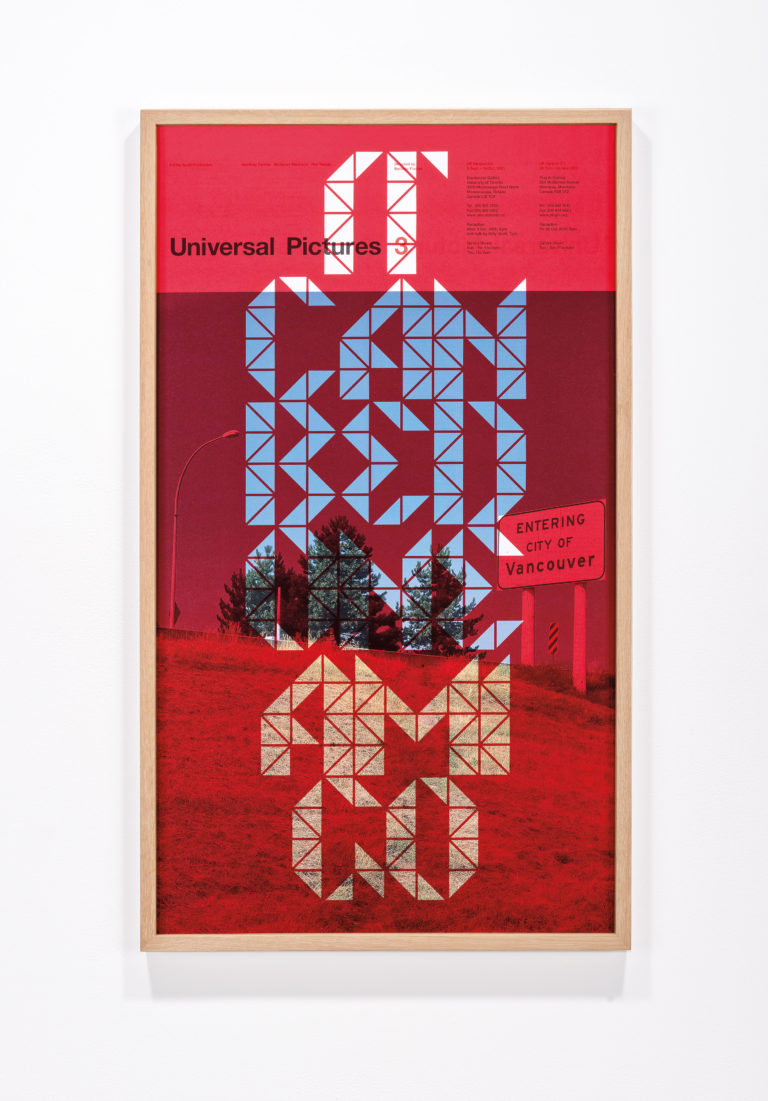 Ron Terada, IT CAN BE DONE AMIGO, 2015. Ink-jet print on offset printed poster (2001), 89 x 51 cm. Courtesy Catriona Jeffries. Photo: Site Photography.
So, in 2015 I used this font in a body of work called Today It’s Me, Tomorrow It’s You: a series of titles of spaghetti western films ink-jet-printed onto original offset-printed exhibition posters I made back in 2001. This poster was for an exhibition I was included in, alongside Geoffrey Farmer and Myfanwy MacLeod, that set out to identify a new sensibility among Vancouver artists; that is to say: a move away from photoconceptualism, all the while still insisting on a geographic essentialism that was born out of the success of photoconceptualism. My desire to return to this poster 14 years later in the guise of the no-name-outlaw-stranger was to drive the final nail into the coffin. The “band” had broken up and everyone went solo. Everyone was in it for themself.
[TMD] Terada’s first steps away from the Goldstein saga, taken even as it was ongoing, brought him back to a long-term fascination with typography. As he mentions, the 39 prints of Today It’s Me, Tomorrow It’s You made use of his new custom font to depict the titles of various spaghetti westerns from the late 1960s and early ’70s: “Too Much Gold for One Gringo,” “It Can Be Done Amigo,” and the like. Printed over old exhibition posters, they refer, obliquely, to the parting of ways of a post-photoconceptualist generation that had come of age together in Vancouver’s hothouse scene of the late 1990s and early 2000s.
One senses some of Goldstein’s sullenness lurking behind these works—which function, like the Jack paintings, as coded references to Terada’s own complicated relationship with the contemporary art world. Beyond this self-referential quality, however, the experiment did yield one crucial insight that would help indicate a way out of the Jack paintings: the possibilities offered by layering disparate sets of information. The 2001 exhibition poster is given a new meaning by the superimposition of movie titles, a sort of repurposing of two found elements in their juxtaposition. Or rather, their transposition—the idea that signification is driven by context, so that a shift of place entails a concomitant shift in sense. That had long been at play in Terada’s work, at least since his highway signage of 2002, Entering City of Vancouver, but Today It’s Me… would appear to have made it urgent once again.
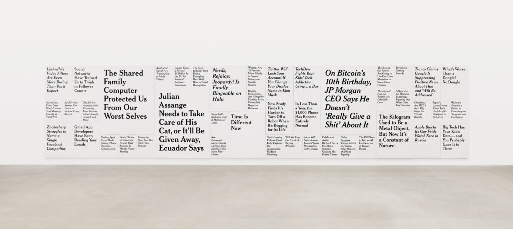 Ron Terada, TL; DR 3 (detail), 2018–19. 44 paintings, acrylic on canvas, 3.05 x 14.03 m overall. Courtesy Catriona Jeffries. Photo: Rachel Topham.
[TMD] Terada first exhibited Today It’s Me… in the fall of 2015 at CSA Space in Vancouver, and the accompanying publicity for the show featured an appropriated meme: a photograph of an obnoxious-looking young kid sitting at a table with one finger up his nose, captioned “TODAY IT’S ME/TOMORROW IT’S YOU.” In retrospect, this one-off joke seems to point toward that vast realm of culture being produced at an ever-accelerating pace in the digital realm. But it was his chance encounter in the spring of 2016 with The Verge, a web-based platform dedicated to examining the transformative role of technology across multiple spheres, from science to media, that would suggest a new body of work to finally supplant Jack. There was something in the breathlessness and sheer variety of its headlines—on a given day last December, these ranged from “New Away Leaks Reveal Employees Worked Without Heat, Struggled with Headaches and Nausea” and “The Science Behind the New Lightbulb Revolution” to “Google and YouTube Moderators Speak Out on the Work that Gave Them PTSD”—that caught Terada’s gimlet eye. Beginning in 2017, such headlines became the basis for his ongoing TL; DR paintings—the title is impatient digital shorthand for “too long; didn’t read”— in which these banners are transposed into the more distinguished font familiar from its use by the New York Times since the early 2000s. The resulting works, in four distinct sizes, are hung chockablock in a tile-like display, opening up new possibilities of scale for Terada.
[RT] By 2016 I wanted to get away from making art about art. I wanted to speak to a larger world and to identify a collective moment. This isn’t to say that discovering The Verge was going to be the answer, or that I instantly knew its headlines could be used to make work. But I do remember copying, pasting and saving my first headline, from May 25, 2016: “Romanian Hacker Who Revealed George W. Bush Paintings Pleads Guilty.” From here on, I would start clipping headlines just for the hell of it. By the end of the year, I started to sift through my list and only then did I think there might be something here in the way of work. So much for giving up painting!
I wasn’t so keen on The Verge’s typeface as it doesn’t portray the feeling of news. Even the wording of their headlines doesn’t read like proper news; they’re too pop culture–inflected, too bizarre to be true, as if the news in question were fake. I knew straight away the typeface needed to have the “look” of news, and that is how I arrived at Cheltenham, the font for the New York Times (though their version is expanded and more elegant).
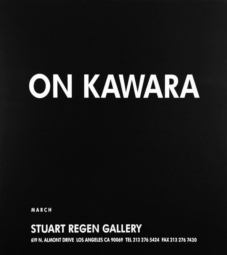 Ron Terada, Untitled (Ad Painting: On Kawara), 1996. Acrylic on canvas, 102 x 94 cm. Courtesy Catriona Jeffries. Photo: Damian Moppett.
[RT] My initial interest in On Kawara’s work was around his use of painting in conceptual art, whose aims it seemed at odds with. The other more plainly obvious attraction to Kawara’s work is that he’s Japanese. I was a third-year student at Emily Carr—this was 1989–90—and the only other Japanese artist I was even aware of was Yoko Ono. (As it happens, Ono’s 1960s “instruction paintings” predate a lot of the conceptual stuff.) Anyhow, what was striking about Kawara’s work was how un-Asian it looked: the date meticulously hand-painted in white, set in a slightly off Futura Bold. Not only is it graphic in a way Goldstein would approve of, but it is sexier than most conceptual art in that it was a painting and not a Xerox or other such facsimile.
In 1991–92 I ended up wasting a year at UBC trying to convert my diploma into a BFA. I was buying time as I didn’t know how to become an artist, let alone participate in this thing called the art world. My only access to this world was through art magazines. And at times it didn’t look like the scene was happening in Vancouver, but it certainly looked like it was happening elsewhere! I wanted to find a way to fit in, so this is why I started making Ad Paintings (1992–96). As a format, the simple exhibition announcement provided all the content I felt a painting needed: it was at once a portrait, a document and a glimpse of the art context or marketplace at a given moment. All aesthetic choices—colour, font, proportions—were already made for me too.
[TMD] Every post on The Verge, or any other news site, comes with its own timestamp, an indication of the moment it was posted and made live. This is merely an accelerated version of the dateline on a newspaper headline, with all
that it implies of the transitory and fleeting. Terada’s TL; DR paintings subsume that timestamp into the slow temporality of painting, with a subtle nod to the practice of Japanese conceptual artist On Kawara, best known for his Today series of monochrome canvases (begun in 1966), each of which bears a white inscription of the date on which it was made. Terada has had an abiding interest in this work—evident in Ad Painting (1996), which replicates an announcement for a 1991 exhibition at Stuart Regen Gallery in Los Angeles— but TL; DR has drawn his attention to an ancillary aspect of this artist’s practice: “I’m actually more interested in the newspaper clippings that sit in the bottom of his handmade boxes that house his smaller Today paintings,” Terada remarks. These are, in a sense, guarantees—indexical proofs—of the painting’s date, and while TL; DR does not operate under the strict temporal limitations set by Kawara, the series does dwell on im/permanence in a similar manner.
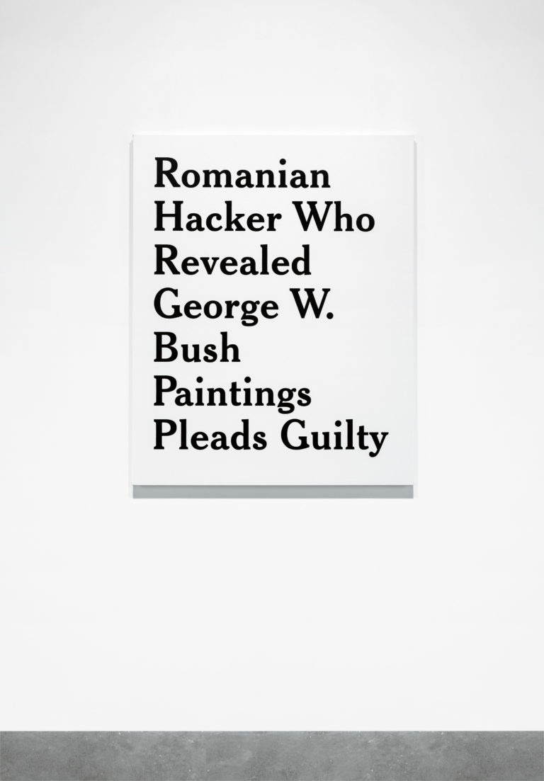 Ron Terada, Romanian Hacker Who Revealed George W. Bush Paintings Pleads Guilty, 25 May 2016, 1:41 pm, 2017. Acrylic on canvas, 1.14 m x 91.4 cm. Courtesy Catriona Jeffries. Photo: Site Photography.
[TMD] It was certainly no coincidence that the first headline to draw Terada’s attention was one related to painting: it reported on the sentencing of a Romanian hacker who had revealed former US President George W. Bush’s paintings to the world. We are reminded more generally of what a significant role the internet has come to play in mediating our access to artwork. Not only do platforms like Instagram give us unprecedented access to studios and galleries, they also increasingly shape the very appearance of what is being made and exhibited there. TL; DR stands that logic on its head, recasting ephemeral web content as the stuff of painting.
David Joselit has spoken of the emergent or distributive image, and of the ways that a digitized culture of networks and data formatting has supplanted an older notion of the discrete artwork as an object. TL; DR, for all its reference to this realm, resists being conscripted into this dematerialized circulation of images. Instead, in a deeply paradoxical, ambiguous manner—true, in other words, to his sensibility—Terada monumentalizes the passing headline, freezing it in time.
[RT] There’s no avoiding any discussion of digital, online or social-media culture in this work without rehashing all of the clichés. But I’m certainly no expert on the subject, nor do I wish to be. I don’t mean for that to sound dismissive, or so TL;DR (!), but I’m surprised anything more needs to be said on the topic when the work is so straightforwardly text-based: the headlines point to all that needs to be said about the moment we’re living in. I think if a painting can do that, then that’s pretty cool. And because the TL; DR body of work isn’t web-based or digital, but rather an installation of paintings, I think the work sets up two simultaneous modes of experience: accelerated and contemplative. The headlines in a given TL; DR installation can span anywhere from weeks to months to years, making tangible the onslaught of digital information as paint on canvas. As for TL; DR as a title, it seemed appropriate in that the articles to the headlines are withheld in a kind of anticipation of reader impatience. Like in Kawara’s Today series, the newspaper clippings remain hidden from view. Even The Verge sometimes prefaces its own articles with the subtitle “TL;DR!” As in much of my practice, it makes sense to simply work with what is presented to me.

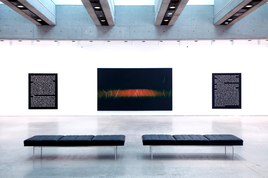 Installation view of “Jack and the Jack Paintings: Jack Goldstein and Ron Terada,” 2018. Courtesy Art Gallery of Ontario. Photo: Dean Tomlinson.
