It is an uncommon experience to stand in a gallery of beautiful paintings surely too large for most private homes, as was the case with Koop’s exhibition at Arsenal in Toronto. Space and scale have long been concerns for Koop, and while she has exhibited in Toronto regularly since the 1980s, it is only now with the arrival of Montreal’s Galerie Division and Arsenal in the city that the Vancouver-born, Winnipeg-bred artist has found a venue truly suited to the size of her works.
“Wanda Koop: 1951–” brought together 25 works on canvas and paper and displayed them across two connected galleries, 1,200 square metres of soaring industrial space. The paintings looked fabulous in the venue. Seven of the largest, all roughly two by three metres, were hung in the larger, more open Arsenal side. They did not overwhelm or conflict with one another; each could be considered individually or taken as part of a larger whole. (It is advisable, when visiting future Koop exhibitions at Arsenal, to stand in the middle of the room and slowly turn.) The vast space allowed the paintings to be viewed at a distance. Home and Native Land (2013) is hypnotic at 20 paces, a murky, pictorialist vision of shoreline and sky in taupes and aqueous blues, cut by two subtle tangerine streaks seemingly dripped into and onto the scene to underline the presence of a creator. Up close, the painting submerges the viewer in murky washes of colour. The same effect is noticeable in Ice Shelf and Night Watch (both 2013). It is the magic of Impressionism carried into the 21st century.
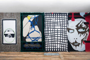
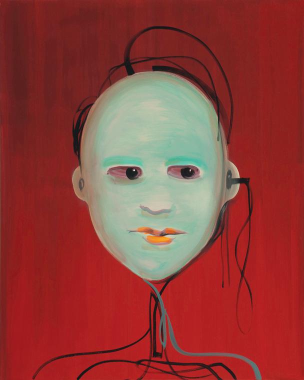
Deft colouration and meta-painting were found throughout the show. Koop considers herself a colourist first, and her skill as such is conveyed everywhere in the landscape and abstract works (less so in the cyber-portraits of the 2012–13 FACE TIME series, hung together one wall into the opposite gallery, where concept takes precedence over beauty or painterly virtuosity). Koop uses colours (highlighter yellow) and colour combinations (khaki and fuchsia) that a less confident and less skilled artist would never try, let alone use successfully.
I stood in front of Reflection for 10 minutes, watching it change. The colours and forms were constantly in flux, like rolling water. With what at times are the most minimal of means, Koop can make an immersive environment that pulls you into it. I wish I had a wall big enough.
This is a review from the Fall 2013 issue of Canadian Art. To read more from this issue, please visit its table of contents.