 Spread from the Summer 2011 issue of Canadian Art
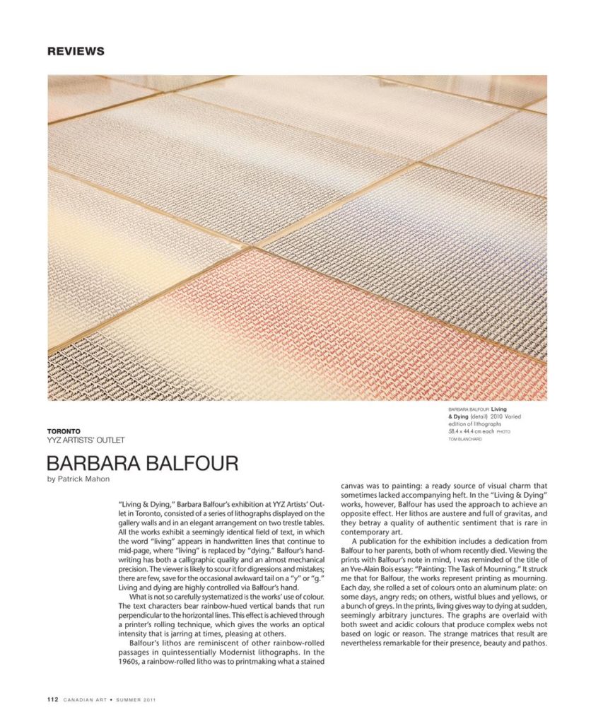
“Living & Dying,” Barbara Balfour’s exhibition at YYZ Artists’ Outlet in Toronto, consisted of a series of lithographs displayed on the gallery walls and in an elegant arrangement on two trestle tables. All the works exhibit a seemingly identical field of text, in which the word “living” appears in handwritten lines that continue to mid-page, where “living” is replaced by “dying.” Balfour’s handwriting has both a calligraphic quality and an almost mechanical precision. The viewer is likely to scour it for digressions and mistakes; there are few, save for the occasional awkward tail on a “y” or “g.” Living and dying are highly controlled via Balfour’s hand.
What is not so carefully systematized is the works’ use of colour. The text characters bear rainbow-hued vertical bands that run perpendicular to the horizontal lines. This effect is achieved through a printer’s rolling technique, which gives the works an optical intensity that is jarring at times, pleasing at others.
Balfour’s lithos are reminiscent of other rainbow-rolled passages in quintessentially Modernist lithographs. In the 1960s, a rainbow-rolled litho was to printmaking what a stained canvas was to painting: a ready source of visual charm that sometimes lacked accompanying heft. In the “Living & Dying” works, however, Balfour has used the approach to achieve an opposite effect. Her lithos are austere and full of gravitas, and they betray a quality of authentic sentiment that is rare in contemporary art.
A publication for the exhibition includes a dedication from Balfour to her parents, both of whom recently died. Viewing the prints with Balfour’s note in mind, I was reminded of the title of an Yve-Alain Bois essay: “Painting: The Task of Mourning.” It struck me that for Balfour, the works represent printing as mourning. Each day, she rolled a set of colours onto an aluminum plate: on some days, angry reds; on others, wistful blues and yellows, or a bunch of greys. In the prints, living gives way to dying at sudden, seemingly arbitrary junctures. The graphs are overlaid with both sweet and acidic colours that produce complex webs not based on logic or reason. The strange matrices that result are nevertheless remarkable for their presence, beauty and pathos.
This is an article from the Summer 2011 issue of Canadian Art. To read more from this issue, please visit its table of contents.