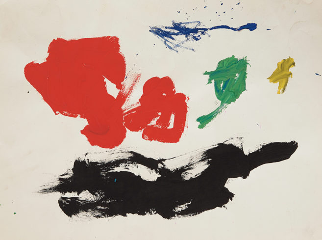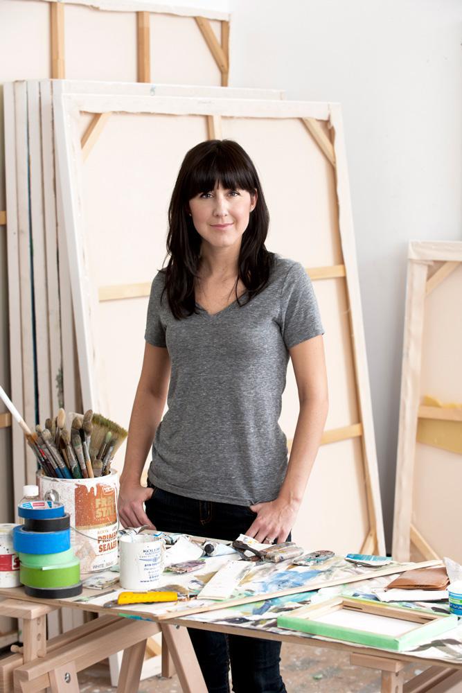
Drawing on conventions of abstract painting, Melanie Authier combines colour, shape, texture and gesture to create a sense of deep space in her works. Recently, she made a change—she opted for a more muted palette instead of a vivid use of colour. The results are currently on view in “Grisailles,” an exhibition that closes March 16 at Rodman Hall Art Centre in St. Catharines. In this interview, Authier talks about the shift.
Q: How would you describe your painting approach in general?
A: My paintings are created through a variety of visual contradictions to create an imaginary space. I do this by referencing the histories of abstraction and utilizing strategies of representation. But everything gets filtered first and foremost through an abstract vocabulary.
To flesh that out, I’m playing around within an abstracted space with ideas of, say, a foreground, a middle ground and a background. I’m also try to break that and flip that on its head. So there’s a certain amount of visual disjunction that I’m interested in creating.
There will also be contrasts of elements that are more geometric in relation to elements that would be considered more expressive; gestures, mark-making, things like that.
One phenomenon is you sense a form is coming forward in the foreground, but simultaneously also shooting back in space. There’s a confusion of the sense of space. And there’s a bit of a conundrum that is offered to the viewer to bring all of this into a certain order.
Q: Some of your works in the past have been quite colourful, but your paintings on view at Rodman Hall shift to a more muted grey palette. Why?
A: Well, colours carry their own sense of space that I can play with. But then there are times when colour becomes a bit of a distraction from other things that are going on—subtleties in atmospheric spaces, or subtleties in brushmarks.
With this new body of work, I’ve muted down the palette to what I’m referring to as a grisaille—a predominantly grey painting. But when you look closer, you realize that these actually have as many colours as my past work. They’ve just been muted down so much that maybe at first glance, colour is not what you’re noticing.
In this series, I’m demanding from the viewer (and from myself) a heightened attention to things like tonal range. At times, there’s confusion about whether light is emanating from within, or light is being projected from outside. It’s another little bit of a visual conundrum.
Q: What about the materiality of these new works? Are you really building up these surfaces, or do you feel it’s about the push and pull between gestural abstraction and the picture plane?
A: I think that what encourages that sense of push and pull is that the surfaces are, in terms of the physicality of the paint, actually quite smooth. I’m attempting to stretch the limits of what acrylic has to offer, so that I can have my cake and eat it too in terms of the really crisp lines and quick response times characteristic of working in acrylic. But I also want this moment where I can achieve some visual effects one would normally associate with oils.
Q: Some of your Grisailles are notably larger than your past works. Can you talk about that?
A: The Grisailles are mostly pretty large—5 by 6 feet or bigger. What I enjoy about those scales is they’re large enough to sort of envelop the viewer. The smaller works are more intimate, but are often still able to offer this sense of this entire imaginary world within them. The small paintings pack just as much information as the big ones; I just work really hard to scale that down into a smaller space.
Q: There seems to be stormy, Romantic intensity to these new works. What’s your response to that reading?
A: I’m certainly interested in the history of Romanticism. But I am also interested in negotiating a variety of opposites: the atmospheric versus the geological, flatness versus depth. When the colours were heightened, it was the natural versus the artificial.
Another thing that I would mention in terms of juggling those oppositions is that any given painting can position itself within those poles of tension. Some of the works might present themselves as more geometric, others might present themselves as more gestural. I afford myself that leeway. So the ratio to which these oppositions play out varies from work to work. It’s important to me that each piece have its own individuality.
Q: Did the shift to a black, white and grey palette seem like a natural progression to you, or a dramatic departure?
A: I am constantly playing within a set of parameters for myself in my studio. I tend to start my work with a type of colour that I haven’t used predominantly, or a colour that I’m not even drawn to on that given day.
What that does is set up a kind of antagonism between myself and the canvas from the get-go. I say “antagonism” playfully!
But it’s a good challenge for me, and it ultimately traps a certain level of energy and dynamism in the final piece. It means I can’t respond to any new canvas the way I have previously. It forces me to stay on my toes.
This interview has been edited and condensed.